Best & Worst Spring 2014 RTW
Keywords: #PFW, anorexia, anthony vacarello, bad fashion, Balenciaga, Balmain, best of Spring fashion, burberry, chanel, christian dior, comme des garcons, diss, Fashion, fashion week, Giles Deacon, GUCCI, JW Anderson, Marques Almeida, MFW, models, NYFW, Raf Simons, Rick Owens, rodarte, runway, simone rocha, Spring 2014, spring summer 2014, thom browne, tom ford, Ungaro, versace, westwood, Worst of Spring Fashion
Be very afraid.
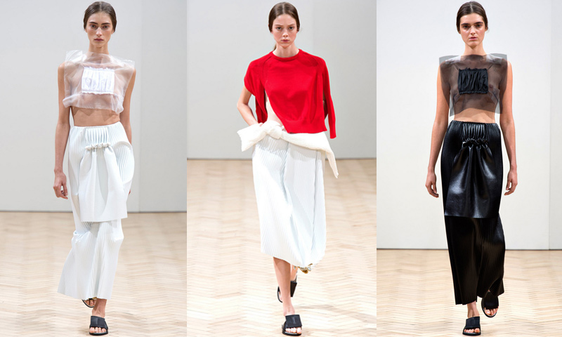
J.W. Anderson
No one does repetition like J.W. Anderson. Each look is beautifully repeated 2-3 times in different color ways, resulting in sudden cognizance of even the most unfamiliar garment. His fetish for neatness is taken to OCD levels, creating something ironically opulent and concisely restrained. But it’s somehow casually obsessive, with relaxed ruching, and noncommittal sweaters hung like necklaces. It’s no surprise that LVMH has taken a stake in his company and anointed him creative director of Loewe. For once the fashion herds, editors, retailers — and now the largest luxury fashion conglomerate — are rallying around someone who actually deserves it.
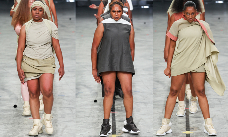
Rick Owens
A polarizing show bound to make it on either Best or Worst lists. Owens created what some felt was a breath of fresh air, while others found it to be an exploitive racial spectacle. There are a lot of potential points in this debate, but one thing’s for sure: FUCK MODELS. These women are strong, hot, talented, and they’re not seventeen. For once Rick Owens looked really easy to wear. No more tripping on trailing strips of soft silk jersey. This was a collection of sneakers, easy short dresses, in a classic Rick color pallet with signature monastic headwear. These women made Rick’s all too serious clothes look fun and approachable. Plus they killed it on the runway. For everyone following in his footsteps… it was definitely Take Your Daughter to #Werk Day.
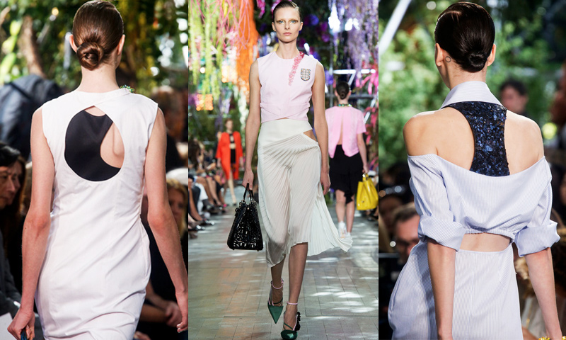
Christian Dior
Raf prefers interesting to pretty — he inspires his customer as much as he makes them uncomfortable. It’s classic but fucked up. It’s really expensive but looks kinda cheap. Even with 77 looks, some really hideous cocktail dresses, and a parade of brocade, we still get just enough Raf to satisfy. You can safely ignore everything after Look 18 and it’s still one of the best collections of the season. This is Raf Simons’ Dior and he never lets us forget it; tailored shorts over skirts, twisted shirt dresses with sequin sports bras and bustiers, pleated skirts with hip cutouts, and couture fuccboi insignia. Sophisticated and polished, but still nasty.
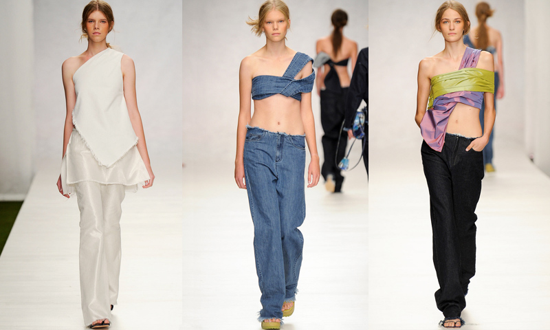
Marques Almeida
Marques Almeida design collections with an uninhibited sense of freedom. Their spring collection was elegant fashion for an eco-communalist Rainbow Gathering. The clothes felt cross-generational — free thinking MILFs and their teen daughters, a dress over pants for the whole family. Marques Almeida should go with this; after all, moms are known for their brand loyalty and they’re only getting younger and cooler.
Versace
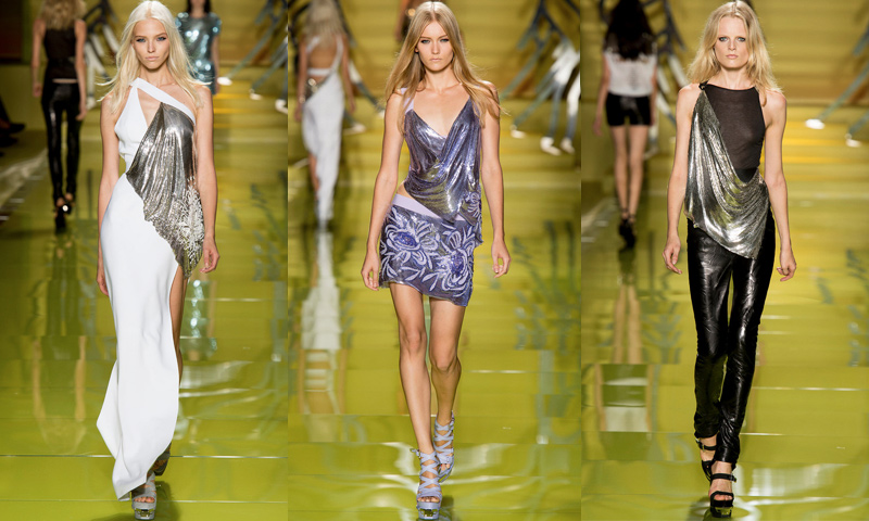
No, Donatella is not a rockstar, she’s hardcore EDM. Donatella is plurnt up right now. Just in time for the House of Versace lifetime original (which was genius and brought tears), Donatella tears it with her specific brand of cheap and slutty. She likes to dress the mistress, but this collection was evening wear for hot DJs. There were a lot of mall stores rolled into one — definitely a Claire’s vibe, some Wet Seal, Journeys, Justice, Juicy, maybe Auntie Anne’s. Zara probably won’t be copying this collection — it’s too mainstream for them — so thank god Forever 21 will. Anyway, it would all look amazing in plus sizes, specifically on plus sized celebrity EDM DJs.
Chanel
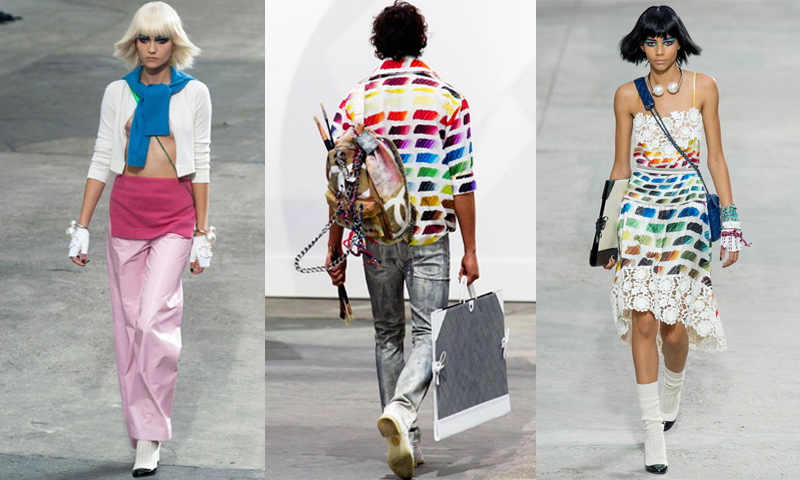
Who needs an easel when art walks on its own shiny heels? Karl’s post-appropriationist runway set catered to everyone who once went to art school, or who has once heard of art. The narrative follows a dumpster diving art-school rich kid, the kind who prefers her Chanel to look bootleg, but not be. Overloaded with arty-nonchalance, she only has Occupy credit cards in her Chanel art portfolio. Camouflaged amidst the play-faux artwork of Karl’s Kontemporary Klassics, this collection is a great uniform for #artselfie-ing or getting laid by Gagosian art handlers. It leaves you questioning: is Contemporary Art Daily the new streetwear blog?
Vivienne Westwood
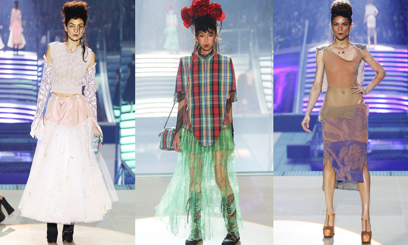
Theme? Fuck that, that’s so conventional. Vivienne doesn’t give a fuck. She’s not that designer who meticulously edits and refines her collection until everything matches. This season her mud-splashed models in haphazard fabrics were providing Frida Kahlo, Little Bo Peep, Grecian goddesses, Eckhaus Latta, the Three Musketeers, the ’70s, ’80s, ’90s, and 1890s — all with the grossest bride-of-frankenstein plateaued mohawks. She’s all over the place, which is oddly refreshing.
Simone Rocha
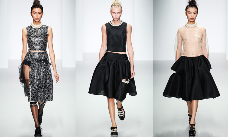
Simone is trolling the UES debutante ball circuit. Her spring collection portrays a distraught, uptown conservatism with a dark, messy, and slyly subversive wardrobe for the rebellious heiress. It’s Blair Waldorf in a K-hole. For Simone, the devil really is in the details: a promiscuous little slit for a pocket, pearl-lined knee highs and chokers, half sewn skirts, cocktail dress separates, and inappropriately exposed nipples to piss off your parents at their charity gala.
Rodarte
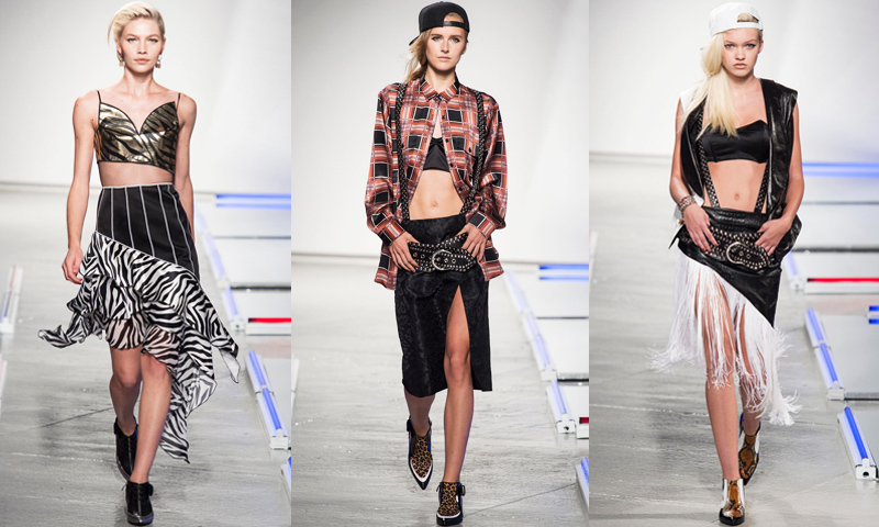
Um… ok yeah this is controversial, but bear with us. On the downside, Kate and Laura are shamelessly off on their cultural filtering — how is this “LA?” It’s obviously Vegas — or is it a sartorialist rendition of Tex-Mex? Calm down with the chola moments, that’s embarrassing. However, on the upside, it’s Necessary Clothing meets Balmain, and more Ke$ha than Rihanna. It’s cheap. What’s amusing is how the Rodarte sisters went hard with female fashion fuccboi-isms. So many hashtags! They may have just missed their Miley mark but they made some bold, costume-y statements with discount oversized and ill-fitted lamé bra tops, the kind that make you look like you’re definitely wearing your bra too high. And maybe that’s hot. Plus those low-slung studded belts? Kinda feeling that. Keep it up, you crazy kids — because you are, you are you are….
Anthony Vaccarello
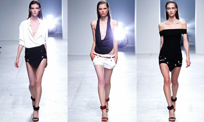
That pointy skirt was all over SoHo this summer, and clearly Vaccarello got confused and thought it was an Alexander Wang — because who would consciously rip off Zara? But what’s done is done, and to be fair, Zara has some good pieces. The real problem is Vaccarello’s shameless pro-ana antics. As a ‘sexy’ brand, it’s vital to represent healthy women. Instead, Vaccarello cuts his clothes to show off emaciated clavicles and pelvic bones in a ‘who’s skinnier’ showdown. Anorexia is not a lifestyle choice, please stop incorporating it into your branding.
Tom Ford
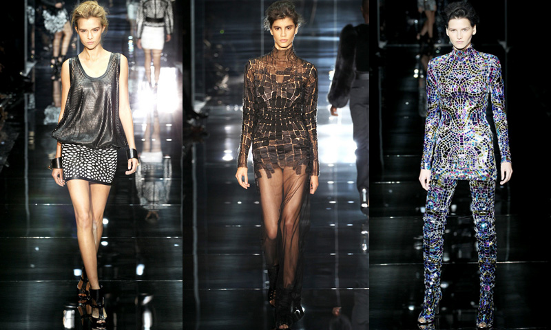
Tom Ford should stick to perfume and men’s suits. Maybe the company isn’t doing so well, because this collection looked cheap as fuck. It was distinctly unoriginal, poorly constructed, and defiantly commercial — a sad, aging attempt at fashion. Maybe he wasn’t trying very hard, and possibly he’s simply being conscious of just how tasteless and old his clientele is? Givenchy trickle down lace/sheer maxis? Mirror mosaics? Get a grip, Tom.
Ungaro
It’s almost impossible to tell if Fausto Puglisi is experimental, or just stupid. He picked some of this season’s ugliest fabric and prints, and as much as we’d like to applaud that, we’re morally obligated to call him out. It’s in poor taste to continue to chastise the sad shell of a brand that still bears the namesake Ungaro. They’ve had so many terrible designers (including Lindsay Lohan and Giles Deacon) at the helm. We promise this will be the last time we discuss this unmentionable company, who are clearly beyond hope.
Gucci
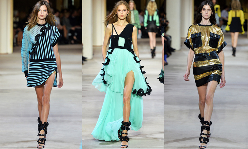
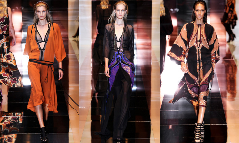
The only woman who will wear this collection is Gwen Stefani and here’s why: Frida Giannini is incapable of getting anything right. But it’s also not wrong enough to be right. Leave it to the woman who made glam rock equestrian and who tried to take grunge to Ibiza to attempt a sporty gym-ready collection made out of suede and metallic leather — and she doesn’t stop there! She simultaneously tries to adopt the biggest trend in seasons (activewear) and “elevate it” (read: butcher it) with art deco illustrations by Erte?! “Let’s make Nike more Gatsby” – This Bitch. It’s simultaneously sporty and old Hollywood, Gwen Stefani’s signature freak flag. It brings the concept of “Forever 21” to septuagenarians. Continuously doing “THIS + THIS = ?” as a design directive is a bad idea and someone should tell her.
Comme des Garcons
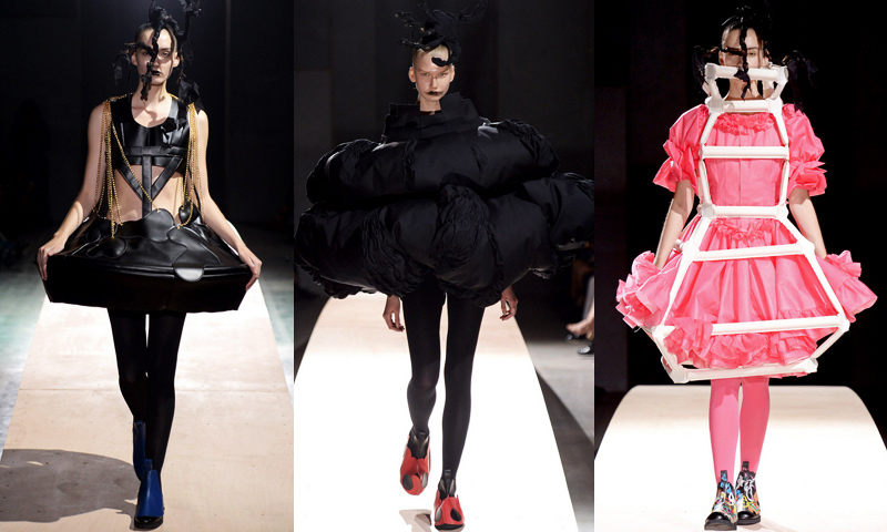
It’s hard to keep going season after season. Even for a creative tour-de-force like Rei Kawakubo. Her spring collection was confined to the sculptural pieces she usually sends down the runway to represent her conceptual frame of mind. But unfortunately, in this case the exercise fell flat. The 23 irrelevant, redundant, and fairly obvious, padded, stuffed, and structurally unsound handmade garments felt gratuitous, meaningless, and even trendy. We’ve seen her do these shapes and techniques better before, when she actually had an idea. Perhaps she needs a Rei-cation?
Giles Deacon
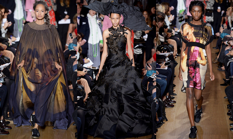
Congratulations Giles, you’ve entered the Worst Hall of Fame. Of all the somewhat successful designers currently in the game, Giles is most desperate for an idea. Born without a creative impulse, he’s strived his whole career to be wacky and fun, to formulate his collection into something with cultural relevance — to no avail. This season his three themes were models (omg how did he think of that!), lips, and bats. Drapey silk gowns were printed with ’90s Glen Luchford pics of Guinevere, Amber Valetta, and mainly Kate Moss. How not meta.
Burberry
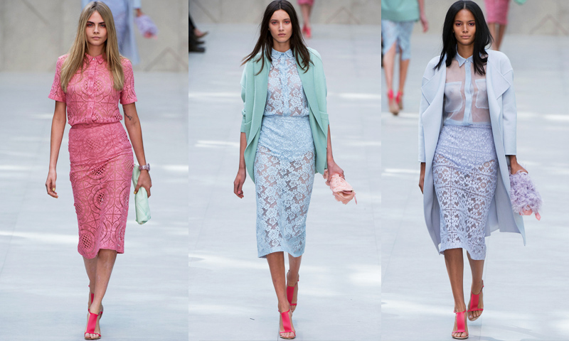
Christopher Bailey is counting on the fact that most people have long forgotten about Christopher Kane’s Spring 2011 neon-pastel lace collection. That all the reviews failed to bring this blatant xeroxing up is a testament to society’s collective memory loss. That, or the fact that Burberry is one of the biggest advertisers in most fashion magazines — so no matter what, they have to love it. But Christopher Bailey, how desperate. It’s only been two years.
Thom Browne
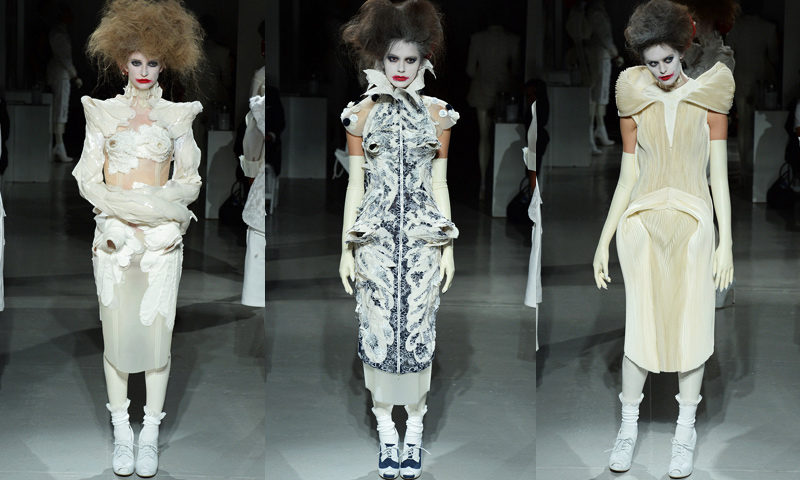
While we love what he does for Moncler menswear, designing fashion for women is a little hard for Thom. His collections are hit or miss, and he always seems to have a lot to prove. The spring collection started strong with gray haired black models in maniacally structured white skirt suits. But then he started watching Matthew Barney films and he got really confused. Suddenly he thought he was the new McQueen, pastiching period pieces with process art, food styling, and joker makeup. It’s like he’s designing exclusively for the FIT Museum. Stop flexing your cremaster muscle, Thom — Bjork doesn’t go out that much.


