Pastiche as Technique
Keywords: aesthetics, Architecture, Art, avant-garde, Beauty, Brooklyn, David Lean, Dr. Zhivago, John Snavely, media, Michael Graves, pastiche, Sylvia Lavin, Tectonics, Williamsburg
Where did all the beautiful architecture go? Instead of holding onto their territory, architects have found solace in efficiency, economy, and the elegance of the diagram. In other words, stylistic and conceptual minimalism.
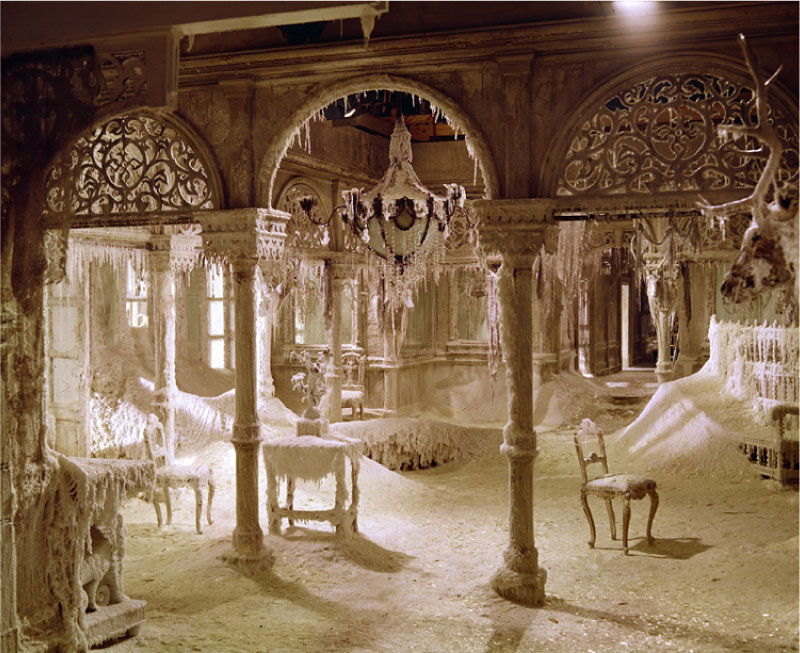
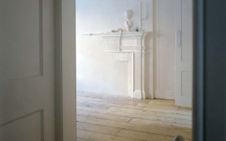
Still from Dr. Zhivago by David Lean
In a recent architecture lecture given at the Harvard Graduate School of Design, the word “tectonics” was used 48 times; the word “beauty” once.
Are we continuing the sensibility of the high-moderns who proclaimed architecture free from any notion of style? Other disciplines like product design, interior design, and a wide range of media arts seem thoroughly engrossed in style—and by extension issues of aesthetics, beauty and taste.
In the realm of critical theory, people like Sylvia Lavin, Wes Jones and Sarah Whiting have been calling for an acknowledgment of style for the past few years. While compelling, their call to action has lacked clear direction for architects on how to proceed. Architects themselves seem uncomfortable with questions of taste and judgment. How would they defend their aesthetic decisions?
Instead of holding onto their territory, architects have found solace in efficiency, economy, and the elegance of the diagram.
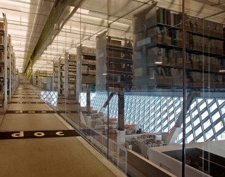
In other words, stylistic and conceptual minimalism. REX’s Seattle Public Library is beautiful, elegant, efficient, and economical, purged of any objectionable extravagances. (See its architect Joshua Prince-Ramos’s TED talk.) This style does, of course, have a place in the built world, but are there other visions that we might investigate, styles that might speak to an aesthetic culture?
Thirty years ago, a series of American architects asked precisely these questions. They explored the relationship between the vernacular and the avant-garde, they interrogated the nature of history and context, and they separated morality from aesthetic production. Although promising, most of their work focused on the façade, not the interior. Their techniques and the potential of opportunistic borrowing, blatant reference, and pastiche are currently an under explored area of the architectural discipline.
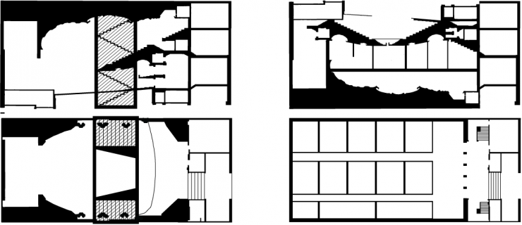
This study investigates the potential of opportunistic borrowing and blatant reference — a postmodern approach pioneered by architects like Michael Graves, Robert Venturi and Charles Jencks — through a renovation that reinstates a movie palace into a 99 cent store in Brooklyn.
There are two major characteristics of the site.
The first is an urban landscape in which transportation infrastructure is dominant. Within a few hundred yards are massive pieces of infrastructure: the Williamsburg Bridge, the Brooklyn Queens Expressway, the JMZ line of the New York City Subway system, Broadway Avenue, a four lane road and commercial hub. Indeed, constructions and demolitions of these structures have had a direct effect on the area. For example, the construction of the BQE corresponded with a major recession.
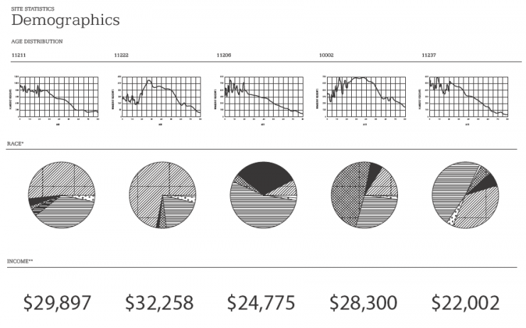
The proximity of these different types of urban systems gives rise to the second characteristic condition of the site: a diverse set of inhabitants made up of distinct groups. Currently, the site consists of a stubborn population that can be broken into three types: hipsters, Hasidic Jews, and Hispanics. Each has not only different age distributions, households, spending patterns, and racial makeup but also very separate neighborhoods and buildings. However, they all share the urban circulation spaces.
The site of the building itself is located at the nexus of all of these systems: directly on Broadway, at the Myrtle stop of the JMZ, one block from the Williamsburg Bridge, and two blocks from the BQE.
Structure
Eiffel’s strategies of truss deformation in The Statue of Liberty showed how a regular truss system could form an ornamental (figural) sculpture while maintaining passageways for internal circulation.
Program
OMA’s Dutch Embassy in Berlin features continuous vertical circulation of ramps that continue, unbroken, from the parking lot to the roof. In addition to framing views and being programmed itself, the circulation space must also negotiate with the programmatic elements of each floor. The plans, specifically, provided a rich case study in this type of architectural maneuver.
Nostalgia
The Laurie Mallet House by Site Architects is a renovation in Greenwich Village in New York City that incorporates plaster cast elements from the previous building into the new design. Literal reference enhances the effect of temporal juxtaposition.
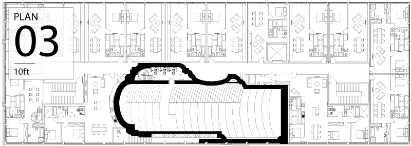
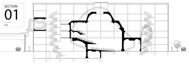
“…the building could be read as a theater where the poche space is a midrise apartment building. Or, when we reverse the relationship, mid-rise apartments with a theater as their circulation space.”
During the production of this thesis, there were a number of unexpected questions and problems, many of which could be further areas for research and study.
To begin, there was the constant struggle to avoid kitsch. Discerning between what is high and low cultural output becomes a minefield of value judgments of which most architects are understandably wary. The payoff, however, was a building with very conventional spaces but a very unusual appearance, proof of the incredible value of appearance. This issue of appearance also created problems in terms of the architectural representation of the project. Extremely conventional modes of representation (inked drawings on vellum in black and white) were used to buttress the project against its own visual provocations. Although these restrictions aided in the success of the project, they were still restrictions. In a thesis that focused on “looks,” careful representation became an integral part of the gradual specification of the vision. This was imperative, since using an intuitive notion of beauty often worked against the development of stricter design processes.
On a more practical plane, certain assumptions made about the economic feasibility of highly ornamented places, while not entirely impossible, represent a design problem that this thesis failed to tackle. Although we are closer today then ever before to building highly ornate spaces, they still incur a greater cost than those unadorned. Even places built of foam and plaster (as the movie theaters of today are) like the Paris or Venice Casino in Las Vegas require a great deal of finesse to craft properly.
Pastiche and blatant historical reference also brought difficult questions into the process. How literal can you be without being insipid? Is there a place for the intellect to perform in this type of project? In short, my own judgment was repeatedly called into question.
Yet, a thesis in Architecture is not only supposed to identify a problem and propose an architectural solution but also, according to Sheila Kennedy of Kennedy-Violich, “offer a set of criteria for evaluation.”
This phase of evaluation and judgment is far richer than we, as architects, are practicing it. There are judgments and values that we’ve left unspoken, as if we all agree on their nature and origin. This thesis replaces all the criteria for evaluation spoken and unspoken with a single question:
