Interviewed4Syndication
Keywords: (art) Video, Artists, Artists Space, Baltimore, collaboration, contemporary art, contemporary internet artists, digital collaboration, DUOX, Frieze Art Fair, New Museum, reality television, The Wire, video art, web design, Wickerham & Lomax
Where do you think your fascination with this multiplicity of presences come from—present in the right now, present in the past, present in the future—requiring these qualities to exist in one thing?
MALCOLM: It’s funny. Our first show consisted of references to buddy comedies, surrogates, choosing a date through questionnaires from model profile videos, and self-discovery through the questions you pose to someone else. I’m gonna say this… I don’t know if its true… but our interest in multiplicities of presence probably came from us having to erase everything we made when we met each other. We didn’t meet each other until the last year of college. But we had each made a lot of work separately. When we started making work together, we had to start over. We had to completely build a hybrid language, which took a few shows to build up and refine. So there is always a dual voice.
DANIEL: That’s why collaboration can be seen foregrounded in the work because it was a main operation. In the Bard show, we followed around pairs of real best friends to think about what collaboration should look or act like.
MALCOLM: I think that’s how we got into this metaphor of parents in the Larkin show. A lot of collaboratives happen to be couples, but we weren’t. But we could fantasize about it or use it as a device. It led to something like gay dads and male pregnancy and the birth of BOY’D. Also in the Larkin show, the use of hospital scrubs pulled in our interest in Baltimore’s John Hopkins enterprises and aligned with couples having children. A lot of entry points for ways to produce work came about through us starting over as two people.
DANIEL: And here is the new project BOY’Dega: let’s deal with 10 seasons as if we’re raising a child. One that starts in season 1 as a shell and is filled with consciousness by season 10. The other main metaphor we use is the fashion house. We think a lot about the archive. Keeping our archive of work online was one reason for a web-based project. Especially so we can dip out of our entire lives and give the keys to someone else. They can use the website to becomes the creative director of DUOX. That’s how we were thinking about setting up our collaboration and developing a DNA.
MALCOLM: I think we like the designer thing so much because the term DNA is used to talk about the sartorial codes of a fashion house and the heritage of the brand. We think about how to construct an artistic “DNA” now, so there is more to make from the structure we’ve built. That’s why Dan and I are interested in peripheral forms and shells or something that could be a little broader and autonomous and easy to read forms so that we can keep it open and adjusting them again and again.
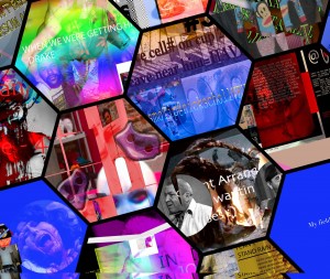
DANIEL: I think we had to learn that quickly in the beginning. We both want a lot from the exhibitions we were making. So we had to find forms that could absorb two people’s input without it looking terrible. This website is an example of that kind of thing. There is a screen in the Bard show [pictured below] with all the hexagons that hold all the references to the show. I always feel like we’re trying to organize tons of information that naturally comes when you have two people giving input all the time.
How would you describe your working methodology?
DANIEL: I feel like we have relatively good luck with the lowest clichés.
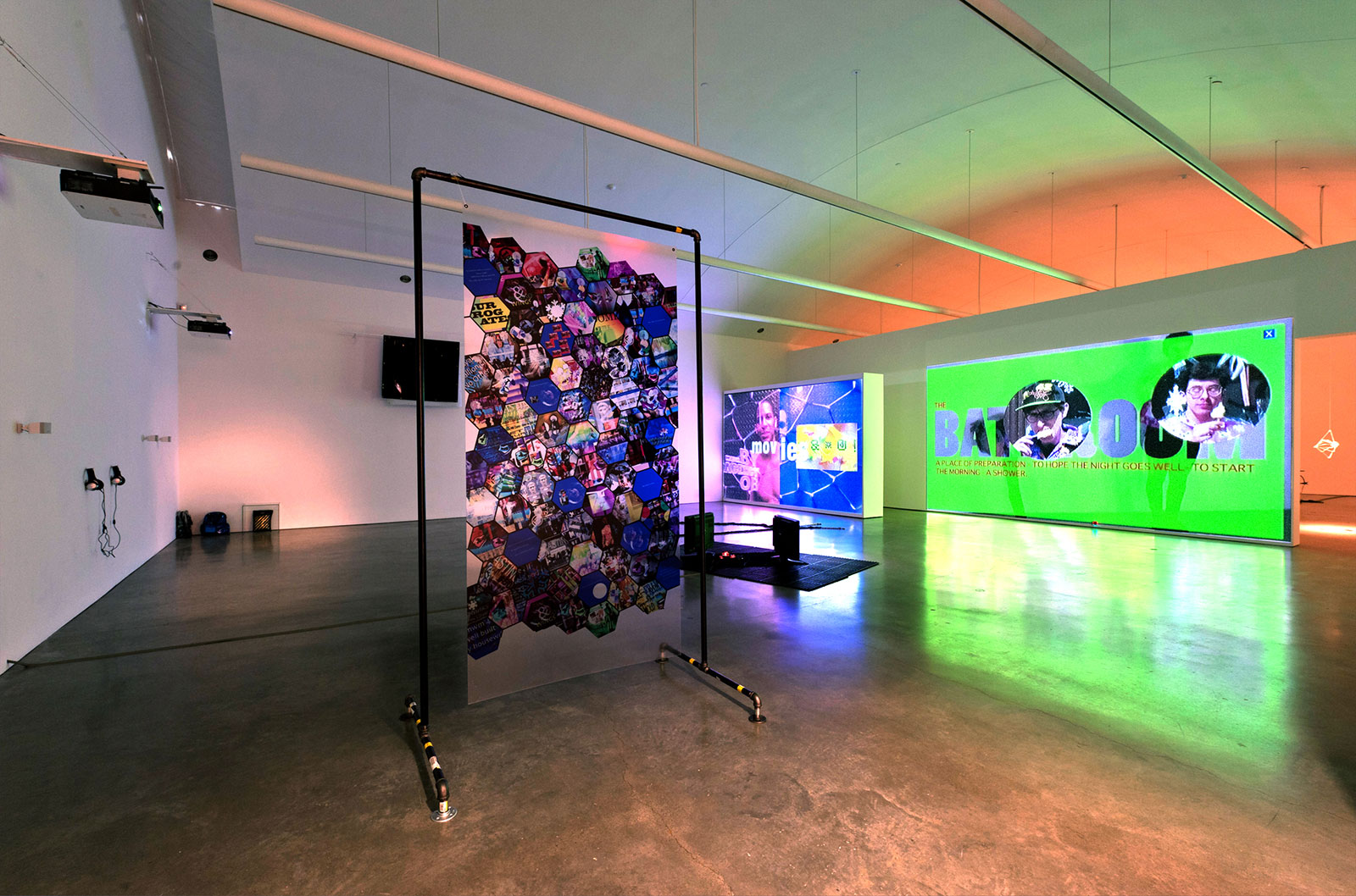
Installation view of Break My Body, Hold My Bones
CCS Bard Hessel Museum, 2011
MALCOLM: I think in the Bard exhibition, the way we worked was task-based improvisation—film this person holding this—but this work was different; so much prep work and tons of work and kind of insane accumulating tons of visuals, watching endless TV shows.
DANIEL: My real answer on our working methodology is to try to investigate form. It leaves you stranded at the very beginning of every new project. And so far we have mostly worked in a project-based way. Exploring forms also can leave the viewer with no relationship to the past work, so iconography was important. When we did the Museum of Modern Twink (MoMT), we were investigating the form of a museum. With BOY’D, it’s a website we’re exploring to see if a fractured story can be told.
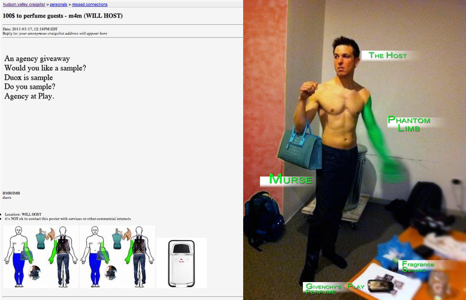
Craigslist ad (L) soliciting the services of The Host (R) at Break My Body, Hold My Bones
CCS Bard Hessel Museum, 2011
MALCOLM: We used these Craigslist ads as ways to get performers to be involved in activating the space. In the Bard show, there are two TV monitors that are trailer versions of the two large videos projected on the back wall. In the real world these aren’t ever in the same space together. You never watch the trailer in front of its own feature. But we like collapsing the experience into a single space where you watch them, the feature and the trailer, together. The little hexagon things on the wall we wanted to have some structure to be a grid of source material or data. I think were really investigating the cross section and collapse of these forms.
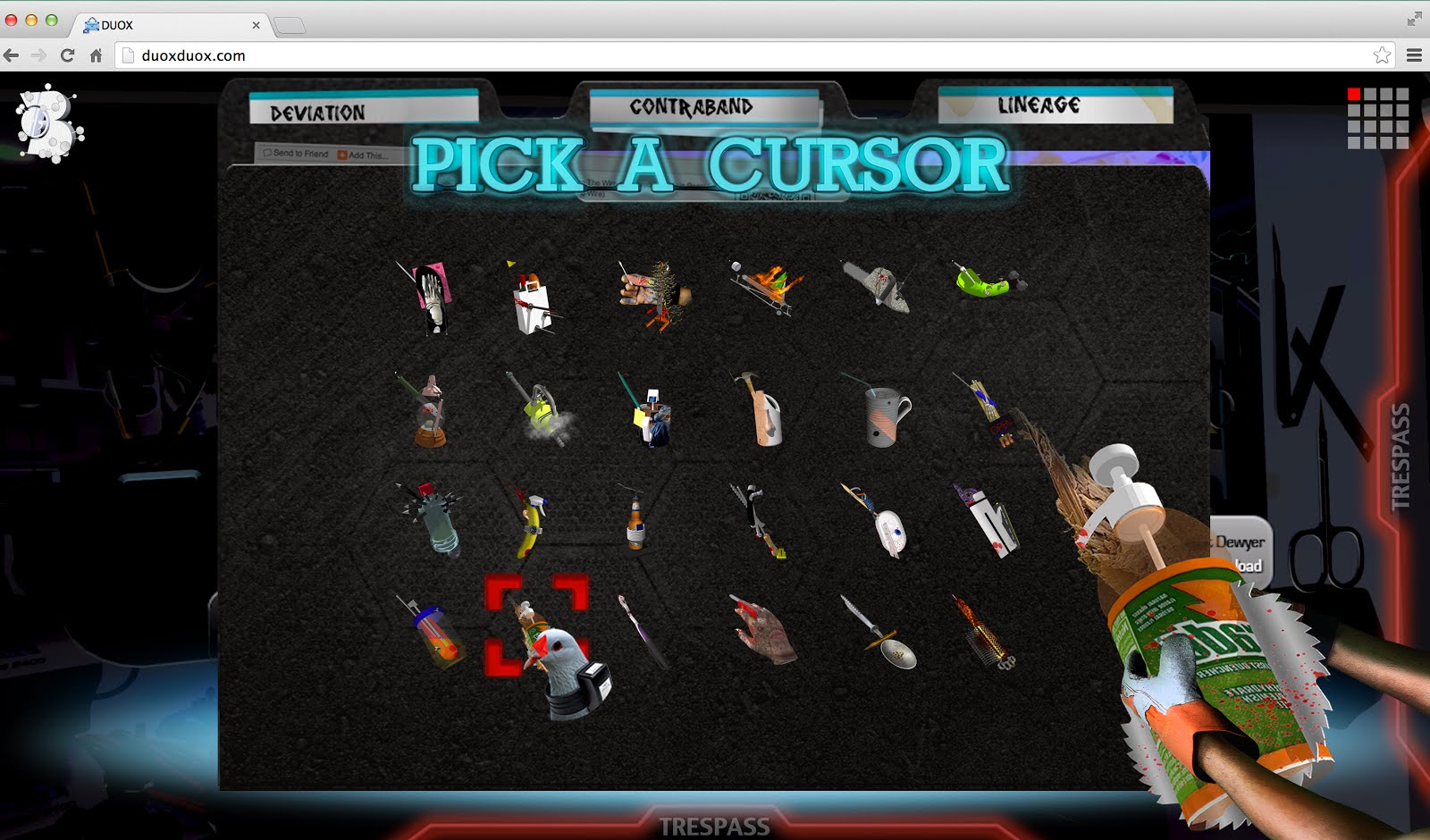
MALCOLM: The cursor that we’ve put on the archive section of the site is a crude version of the Artists Space cursor that was retired some time this year. We kind of took it and aligned it with the DUOX4Larkin installation.
“So far our work has been about discovering the potential in liminality. Understanding that it can instill empathy and prevent wars.”
BOY’Dega is being presented as a kind of blueprint or diagram that will generate more projects and more episodes. How do you plan to elaborate (or not) on this process?
MALCOLM: Richard [Birkett] from Artists Space asked us why the freestanding [hexagon] image was in the Bard show. We were trying to tell him we wanted to pull all the source material and references into the exhibition. And what we tried to do this time was take all the supplemental forms of a television show and put those in season 1. Those supplementals might be a diagram, a fan site, or a storyboard—and that would become the actual work of season 1.
DANIEL: We are always trying to figure out how to get the center to be empty and the edges to be really full. So we knew season 1 would be weird to experience aside from the complexities of navigation… because you have very few of the future seasons to map onto this blueprint.
DANIEL: Back to mood boards. My interest in them is how little inspiration is actually taken from them to make a collection. So already it is a shell of a collection. I saw one the other day where the designer made a bag and then made a mood board afterwards to figure out what the zipper they had used represented. It was a perfect example of how useless references can be when creating something. I’m so negative all the time.
No you’re not, but one of you mentioned when your did the Larkin show, “We were so young and optimistic and we just did it and now we’re totally bitter and we don’t care if anyone understands the website.
MALCOLM: I said that!
Malcolm was like, “I don’t care if anyone likes it.” I’m exaggerating, but I was struck with BOY’D the character as being kind of indifferent to being liked. There is a way in which the work is seductive and inviting, but it also withholds and keeps you at a distance. I’m interested in this dynamic and Malcolm speaking in relation to the indifference to being liked. I mean, you obviously want people to like it, but I’m wondering if you could talk about the tension between seduction and distancing. Or if you even think of it in that way.
MALCOLM: I think we were trying to build a strategy that would excite us in making the site. So something difficult in its production [is] at the same time something difficult for a viewer who is used to things for a form (such as a website) that is about directly pleasing them. So we wanted to use television themes… and we could have easily built a television show and made a few episodes, but we didn’t think that was the goal of this. We knew that all those other things around television informed its strength. Its social media landscape and the things that happen with Hulu or Netflix and how people can receive those things—which I think are the things that are a little more difficult for the people who try to match a demographic, those people, instead of a targeted consumer. So in that way, all of those formats became interesting if we could cross pollinate them and add obstructions to them; we could add transparent overlays to the site just to slow down the experience of the viewer.
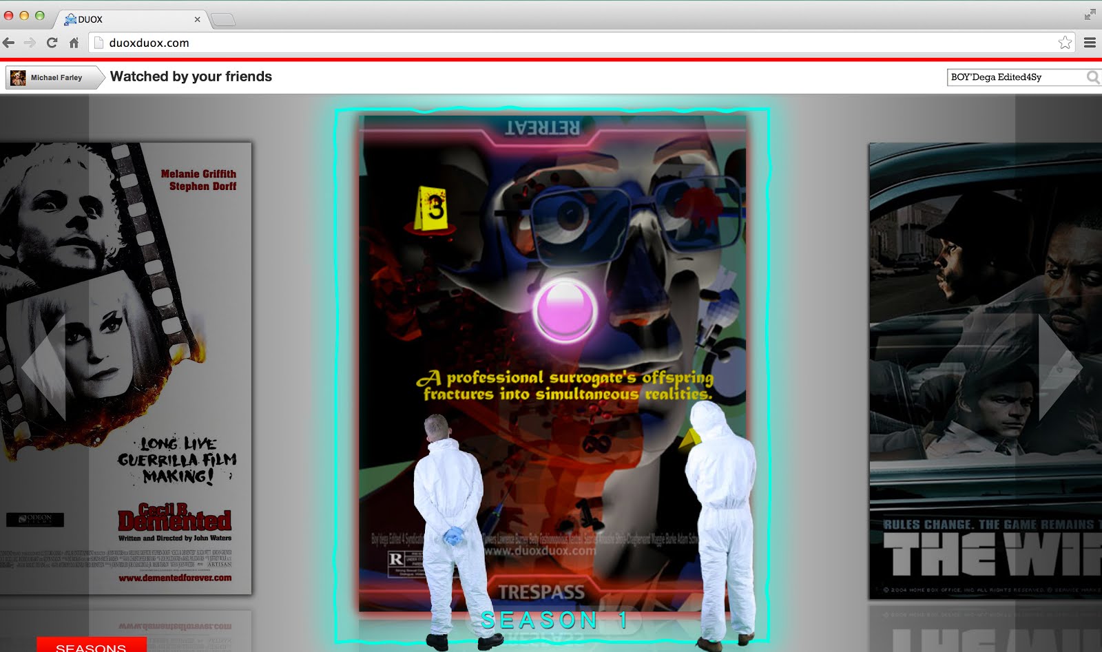
Screenshot of BOY’Dega: Edited4Syndication
2014
Is it mentioned anywhere on the site that The Wire was a huge reference?
MALCOLM: I think only in the framing on the New Museum’s site, but there are a lot of references we pulled. We built this BOY’Dega model where these hierarchies would go away when we tried to occupy the fan, the actor, the character, and the author’s spaces as the maker. But as a fan not just of the thing we made, but as a fan of The Wire. We were trying to see how the fans used the information, and usually through fan fiction they usually know if you are a true fan, then you should know this amount or have kept up with the nuance of the show. We would take small aspects of the The Wire and pull them into the work.
DANIEL: We liked how The Wire worked as an export for Baltimore, creating a reputation that spoke on behalf of the city. Crime in general was a reference because it was so pervasive in television shows. TV has sort of moved away from that recently, but you couldn’t turn the TV on without seeing a crime lab or forensic teams. We could present images as if we were investigating them for clues. We could treat the screen like a crime scene. Blood splatter is everything in season 1.
MALCOLM: I think it was also a way to include any genre. You can have a show like Judge Judy or you can have a forensic-based crime show or you can have an urban drama like The Wire that happens to be about the city. There are tons of fantasy shows that blend something like Sleepy Hollow with a conventional crime procedural or sci-fi like Almost Human. Crime shows have tons of sub-genres. We wanted the flexibility to take any of that visual language that we could and apply it to any place in terms of genre. We knew we wanted to leave not crime nor bad deeds behind… but more so leave this kind of forensic drama aesthetic behind.
“We wanted to be in front of the camera and up the block watching simultaneously. That was our relationship to The Wire.”
BOY’Dega: Encore in the AFTALYFE [Season 2], 29 min 48 sec
Premiered at Frieze NY 2014 in conjunction with Artists Space
I remember, when we first met, doing that annoying thing that people do when they meet people from Baltimore. I asked what you thought of The Wire and was surprised when you said you hadn’t seen it. Since then you’ve gone back to the show and taken it up as a central object in your new project, BOY’Dega: Edited4Syndication. How and why has The Wire entered your work, and what is the effect of “coming late” to it? So that the text is now the show plus, and inseparable from, the mystique surrounding it.
DANIEL: Every time we start a new project, we’re usually attempting to investigate a form. BOY’Dega is an artwork that uses the form of a website to create a television series by reimagining the structure of television and the potential of its audience. We were interested in our new cult-ure of television. Having devised this general direction for the project allowed The Wire to drop into our laps for consideration. Despite the extreme locality of The Wire, it speaks of every city’s violence and community struggles—and strengths in some way. The show’s strength is its universality. That’s how we wanted to use The Wire—as a reminder that we could focus on Baltimore without fear of only speaking to those who live here. At the same time, The Wire had created an image of Baltimore that was abandoned, violent, like the Wild West, and that you’d have to be crazy to want to live there. We liked these distortions, these clichés of violence and decay, and we embraced them.
MALCOLM: I think Daniel and I arrived at The Wire as a central theme separately but simultaneously, which felt serendipitous. This delayed relationship was important because it was how we chose the resulting form of the project, this streaming on-demand, TV-based web platform. I can recall several instances where the narrative that is The Wire had chosen me, followed me, and I hadn’t built any relationship to it… When I was on vacation, this question of The Wire came up a lot, and I was personally perplexed by inheriting the legacy of a cultural product that could specifically inscribe my city self. I felt what Daniel and I were/are attempting to do is/was amending something that had become a proponent of altering our reality. So it led to this model that we hoped would describe this phenomena we experienced. That took fan:creator::character:actor and complicated their hierarchies. The levels of criminality and dysfunction in narratives about Baltimore have a vast set of visuals that we could traverse, and The Wire was a starting point.
One of the great things about The Wire is how it turns its back to the audience. You get the sense that it couldn’t care less whether or not we’re watching, and it would just go about doing its thing regardless. This is the total opposite of something like The Sopranos, whose every scene is calculated for an effect and mugs for the audience. I was thinking about this question of audience address watching BOY’Dega, which seems to use both strategies: on the one hand the elaboration of kind of remote hermeticism or private language, and on the other hand a very direct, often very funny address to the spectator.
DANIEL: David Simon is often quoted as having said, “Fuck the audience.” I take this to mean give the viewer something they didn’t know they wanted. Certainly people didn’t want a complicated website project based on a failed TV series set in Baltimore whose main character, BOY’D, was an allusion to our last exhibition, DUOX4Larkin. In considering the form of a website, the navigation was carefully designed to be content both visually and structurally in order to create a feeling that one website housed many websites within it, each distinct in style and functionality. This is one way we tried to explore our own question: Could fans, authors, characters, and actors be equal in the process of creating a series? BOY’Dega requires one to navigate interfaces that look like videos games and fan pages and trailer promos, use mouse cursors that look like contraband and weaponry, buttons disguised as ads, a bird house that’s hospitable to user input and feeds it into a wiki. We focused mostly on providing a high level of personal choice but with the caveat that the choice isn’t a free ride or a choose-your-own adventure narrative. In other words, the website isn’t a passive experience; it isn’t a Feed. It’s a set of barriers that need to be confronted and managed, with the hope that the user becomes dislodged from tempo of the Feed.
For example, of eight main sections, you may choose one titled Characters, where you can pick from eight main cast members, whose profiles each have a dozen videos and text and hidden rollovers that explore their on- and off-screen lives simultaneously. Being in a collaboration requires a joint history to be built and we have always used the idea of a fashion house in order to think through our DNA and setting up an archive. A website was the best way for us to make that DUOX DNA visible and chart the mutations they would take in the future. This is a sort of private language that we want a viewer to be involved in. In case we need a creative director to step in and carry out our vision, they would have the website to draw on.
MALCOLM: I think this is a question about accessibility. We wanted the work to be very approachable but did several things to have it removed from the realm of easy viewing. In the construction of the site, we needed all these walls or content-laced obstructions to slow the digestibility of the work down. I think this has something to do with us starting in installation, where you want the viewer to arrive in a space and experience the totality of that space in a temporal/associative way and not just relate to autonomous works. We considered the audience, hoping it could be anyone, but of course that’s not the case. Our work isn’t for everyone especially when aspects of the first installment of the project are essentially us mapping and setting the stage. A viewer really has to be patient and realize that aspects of provisionality are built into the form.
DANIEL: One of the things we wanted to do that never worked out was something Malcolm had thought of. We wanted to create this studio space on the website where visitors could contribute more intensely, realistically, and less rigidly. We had this idea to make greenscreen paintings for a show that you could photograph yourself in front of and digitally select the project still already loaded on your phone to put behind you and upload that to the fan section.
Where visitors to the site could submit photos or write text?
MALCOLM: Yes, but also kind of forum-ish. Where you could have a dialog amongst people who inhabit that space… and with us. We could also participate in that. We are always trying to adjust the relationship between these character : actor :: fan : author.
DANIEL: I would explain this to Nick and he would look at me like, Do you just spend your time thinking of ways to annoy me?
MALCOLM: I think it is a marriage of two difficult things to construct, A social network, plus some kind of chat forum.
Lets talk about OMAR!
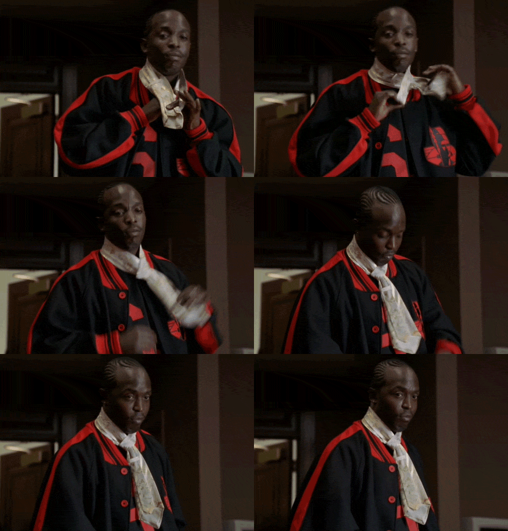 MALCOLM: Omar is amazing. I mean let’s consider that FACE as a foundation for character development in itself. This visual index, a buck 50, sets up all kinds of narratives for an audience. Omar brings to mind Heath Ledger’s depiction of the Joker, where they both have these idiosyncratic trademarks around their crime lives (Omar’s whistling and code, the Joker’s cards and smile carving). Omar’s vigilante approach to robbing drug dealers and the Joker’s criminal activity as a corrective to Batman’s deeds—two figures defined by who they’re up against. And oh, the faces. Whole stories in the faces.
What kind of critical relation, if any, does the project have to culture or commodities, products, etc.? I’m interested in this question as it relates to form, how the work mimics or parodies various sites like Netflix, etc. And the way Dan talks about resisting the feed, working against the flow of corporate algorithms designed to sell things.
DANIEL: That’ s right. We would look at popular sites to lift their layouts, like Hulu, Nextflix, Xtube, movie trailer sites, gaming sites, etc. We did this without irony. We wanted BOY’Dega to mimic these interfaces but not parody them. BOY’Dega is a blueprint for the following seasons, which makes it inherently a preliminary experience, a shell. That’s why these lifted interfaces are so similar to their source. We aren’t trying to form a critique around the notion of interfaces; we just needed to render them visible in a larger puzzle we were building. I agree with what Jordan Wolfson said in a recent interview—that maybe the most radical thing to do today when using, say, a Beyoncé song as the soundtrack for a video, was to do nothing. To not change the pitch or remix it; just to use it. I think this is kind of where we’re at culturally. We’ve come out of remix, out of shifting contexts, out of “making it your own,” and now we’re here as a result of circulation and the way it flattens everything. The viewer has acclimated to that mode, and the image has built a resistance to current approaches.
Our project’s form takes a critical stance towards that flattening effect. How can we make something that isn’t disposable, something that’s immune to the voraciousness of the Feed? Because reproduction is such a complex central element in culture, creating a form that couldn’t be copied was our organizing principle.
One thing we didn’t borrow from other websites was their accessibility. As you say, most sites are set up to sell something, to make or keep a customer base—so design is predicated on achieving this. Our site only cares about how you get from one place to another but not why or how fast. We incorporated banner ads into the site but tried to recode their function. They almost never appear, but when they do pop up, they “sell” part of a character’s narrative. They’re another way to draw you deeper into the lives of these cast members who are at the center of this season.
BOND profile video from BOY’Dega: Edited4Syndication [Season 1], 47 sec
2014
“One of the main aspects of Season 1, simply put, is Finding your way, and just enjoying the hustle of navigation.”
MALCOLM: Our relationship to compounded forms (forms that can’t stand alone as artworks) metaphorically lend themselves to a Politics of Exchange and sharing, concerning ourselves with the lack of autonomy one may have, in a negative sense, but a symbiotic quality in a positive sense. We were tired of misreadings of our approach or of the work, so there is definitely a strategy to how and why we distribute or alter anything. Because the lifespan of an image is on a continuum, I don’t question our right or strategy to use that image if we think it serves an idea. I also believe in a visual utility. There is a usefulness to the images we all produce. I don’t think reproduction degrades an image especially when we’re in a climate that allows the general public to manipulate and distribute them. They in themselves have become a language. An image’s adaptability and persistence is something I find positive and it being an artwork still has utility to me. Ultimately utility functions on a spectrum, and I apply this to the project as a politic because we can only hope that people co-opt aspects of the images on the site or ways things were framed in a way to expand their usage or potential. And partly feel liberated from our authorship. But I also don’t fuck with everybody and every idea.
I wonder if you guys have anything to say about working in sculpture/installation vs. online? I keep thinking about BOY’Dega in relation to Larkin.
DANIEL: I love installing exhibitions. I was rereading a Jason Rhoades catalog yesterday, and my head almost exploded every five seconds. His work Cherry Makita is focused on a suburban home garage that is used as a metaphor for an Egyptian tomb. That is such a great idea. And the dust from the sheetrock on the exhibition floor stands-in for the cocaine sold by art deals, which Rhoads equates to drug deals… and the more cocaine/sheetrock dust you get on your feet, the more you understand the installation. This is my love language.
I hate when installations are de-installed and they become just documentation. Some of my favorite things we used to do in installations from the very beginning were an emphasis on The Opening, an emphasis on creating a memory in the space. A focus on snacks and hosting and drinking and giving exhibition tours and designing tables and communal napkins that hung next to the work to wipe BBQ sauce off your hands from the wings we were serving. All included the guests in the show’s production/destruction. Or hiring strippers to pass out flyers for our future exhibitions or having shirtless green-arm man spray perfume samples on passers-by or driving my car out of the gallery to the afterparty, leaving a hole—were all attempts to insert the right kind of energy into the gallery space and to add some fun where it usually isn’t. Which suddenly seems critical because it wasn’t supposed to happen. At least it didn’t usually happen in Baltimore.
Still from BOY’Dega: Encore in the AFTALYFE
2014
After five installation shows from 2009 to 2012, we wanted to try something new. So we developed BOY’Dega, online in ten parts. This freed us from documentation because the images and videos of BOY’Dega were in their native context, the website. This allows us to build a more synthesized relationship with a viewer who can return at any time to see the development of BOY’Dega. We felt like, before, the viewer wasn’t able to sense the exhibition from its documentation. It was hard to document the vocabulary happening between works that were often being misread in gallery installations.
So BOY’Dega was intended to create more bridges for a viewer to cross into the vocabulary we were evolving. Some of the ten parts of BOY’Dega are gallery shows but are folded back into the online project, though not simply as documentation. These BOY’Dega “spin-off” exhibitions could still be focused by BOY’Dega’s framework, allowing us to work faster and more freely in real space and time like a vampire virus bitch. (This word framework—whether I’m using it correctly or not—means to me: Creating an opportunity in an arena which felt alien before. For example how can a framework allow us to be TV producers, how can a framework allow us to be standup comics, how can a framework allow us to be artists, how can a framework allow us to be better citizens? The implications of a really good framework is that it doesn’t only work for the artist but can be passed over to the viewer.)
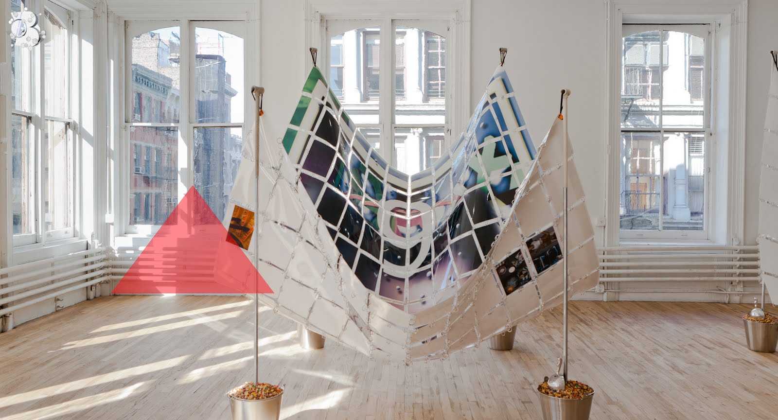
During previous exhibitions we’d often spend a year making the show… and a week installing. We did a show at the Contemporary Museum of Baltimore in 2011 with hanging ice purses that came together very easily. Sometimes during that final week, nothing works. When we installed the DUOX4Larkin exhibition at Artists Space in 2012, everything we had planned went out the window. We were up against a large loft space that had its own personality, and we were battling to either include that space with the sculptures or push that space into the background so the work could sit at its best. I think if we were really brave, we would have thrown everything in a pile in the center of the gallery and shown billboard size banners of mood boards (a useless tool we love) to cover the gallery windows.
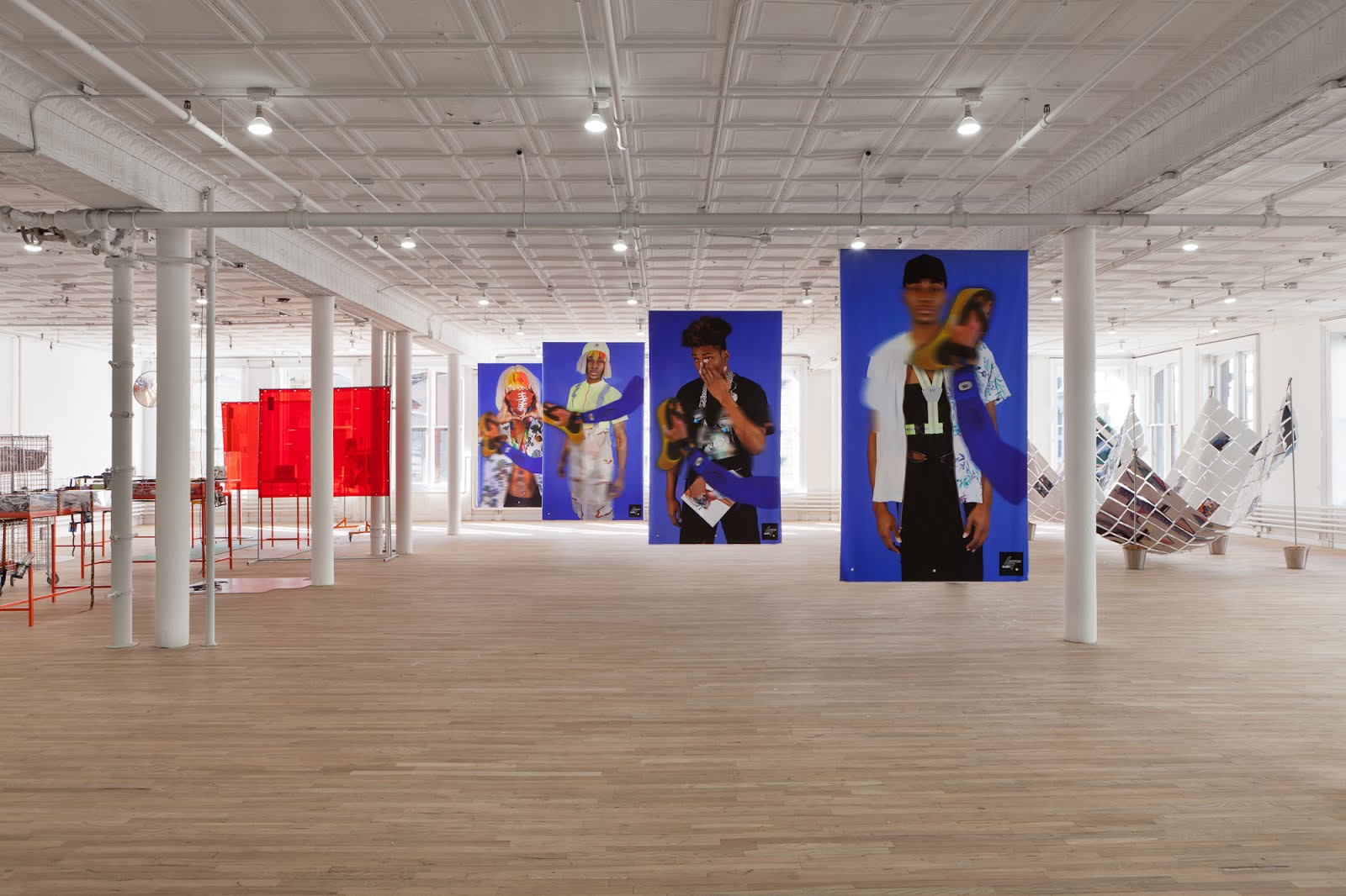
Installation view of DUOX4Larkin
Artists Space, 2012
DANIEL: Managing the speed between objects to develop their relationships is a lot of what we’re doing during installation. What order does information enter the viewer’s brain, what is the viewer going to remember, and how can we manage expectations. These concerns are similar online and offline. Creating BOY’Dega felt similar to installing rooms in a gallery. A one-week install became a three-month install when working digitally. The process of making a website is harder, but we could approach the target with more accuracy. Because BOY’Dega was coded piece by piece over time, it felt similar to building a painting.
BOY’Dega had no curator input. We had a lot of input from Stefan and Richard at Artists Space, and you [Nathan] at Bard in organizing the gallery space. I remember installing a headphone hook in the Bard show, which is a huge space, and this tiiiiny little normal hook was screwed into the wall. It was too funny; it had no energy. It was just functional. I wished we had found two hot best-friend-boys on Craigslist to come punch a hole in the wall. That would have been a great place to hang a pair of headphones. Part of that show we did with you was about best friends as surrogates in relationship to collaboration, and we also presented video gay bar interviews. With BOY’Dega I felt like when we were creating all the images and buttons and interface design, it was a matter of how can we (s)top ourselves this time (not bottom). How can we really embellish this button or rethink this surface and just go to the end of the earth keeping every excessive detail we love? And I felt we were able to do that, which was a luxury. I don’t think this is a net artwork; it’s an artwork on the web. Online had fewer restrictions than a gallery, and we knew our mutating vision of the project would be best served online because
BOY’Dega is based on a child (BOY’D) imbued with consciousness that was born in the Larkin exhibition and will continue to transform with digital ease.
MALCOLM: We wanted a drastic shift in the work, not in terms of content, but in form—something that didn’t feel finite but expansive and would be achieved through a viewer’s fatigue with the amending of the project’s content. We were tired of conventional ways of presenting a set of objects in the gallery space. This project has been a continuation of Larkin; what we discovered then was we like the notion of a protagonist and character development with no explicit narrative. So we created this ensemble cast that functions on an associative level (people that we could endlessly riff off of). The psychological space while producing Larkin was full of optimism and young fervor, which means we knew what we were doing but mostly not. This virtual space we’re working on is a little more trying, difficult, and to some degree indifferent to being liked, and we were combing through various ideas, attempting to figure out ways the work can satisfy our relationship to the practice. It feels like when the two of us are together brainstorming. It seems like we threw no ideas out, but we threw tons of them out. And for a large amount of the time, we hated making things. So lazy. I think after the initial staging of the project, we are interested in coming back to objects to further reinforce peripheral forms of television production—whether that’s pre-visualizations, catered craft service towels, or animation cels.
The early work would always leave us resolving the show’s ideas in the space and having at least a week of not sleeping and living with the work in a spontaneous way until the ideas settled. We wanted this new thing to feel more organic in why and when we contribute to it but that had a serial system, so that it implied additions.
Do you feel like you challenge yourselves?
DANIEL: Yes, but we want it to be easy.
MALCOLM: We thought this website was going to be easy. “Oh, we won’t have to sleep in a space for a whole week to make sure this is right.”
DANIEL: I like installing.
MALCOLM: Dan really likes installing exhibitions. I don’t like carrying anything.
I liked this process more. We worked very long days, but we would sleep and wake up and restart. But when we put up installations, they’re so time sensitive in a different way. It was really crazy. But usually we wanna just sleep in the space.
DANIEL: It’s such a luxury to see something you made be folded back into this huge system you had built. As we got close to the deadline, it was an interesting high to have. We were tired as shit.
BOY’Dega: Untitled BOND [Season 3], 5 min 50 sec
Premiered at on Link Cabinet in conjunction with Link Art Center
You guys were talking about building frameworks for your own identities as artists, or fashion designers or web entrepreneurs or T.V. producers, and how these frames can be shared with your audience. How do you think about developing and deploying these frameworks?
DANIEL: There are good frameworks and bad frameworks. Or I should say good ones and better ones.
MALCOLM: I know, I was going to ask maybe something about old fashioned conceptual strategies. Like you build a simple framework or something and then whatever the work is that comes out of that, that’s the work. This kind of wasn’t like that. We had to really identify what a fan should be or is, and sometimes it’s through a set of stereotypes or archetypal things. And I think that is the weird and difficult thing about the project: taking a real person and having to turn them into some kind of static, weird standard and then try to make ourselves make a version of them is a weird caricaturing of what an actual thing is. But it produces some weird results.
DANIEL: But not too flat?
MALCOLM: No, because there are other layers to the work. I mean if that was only the work it probably would be a complication. But because the project deals with interfaces and how things occupy different spaces I think there are other things that kind of fill out the work.
If the rites of passage are about shaping personality and foregrounding agency, which meaningful passages do we have left? How can we map new ones that stabilize the society?
“As gay dads trying to raise BOY’D, what the fuck do we have to offer him?”
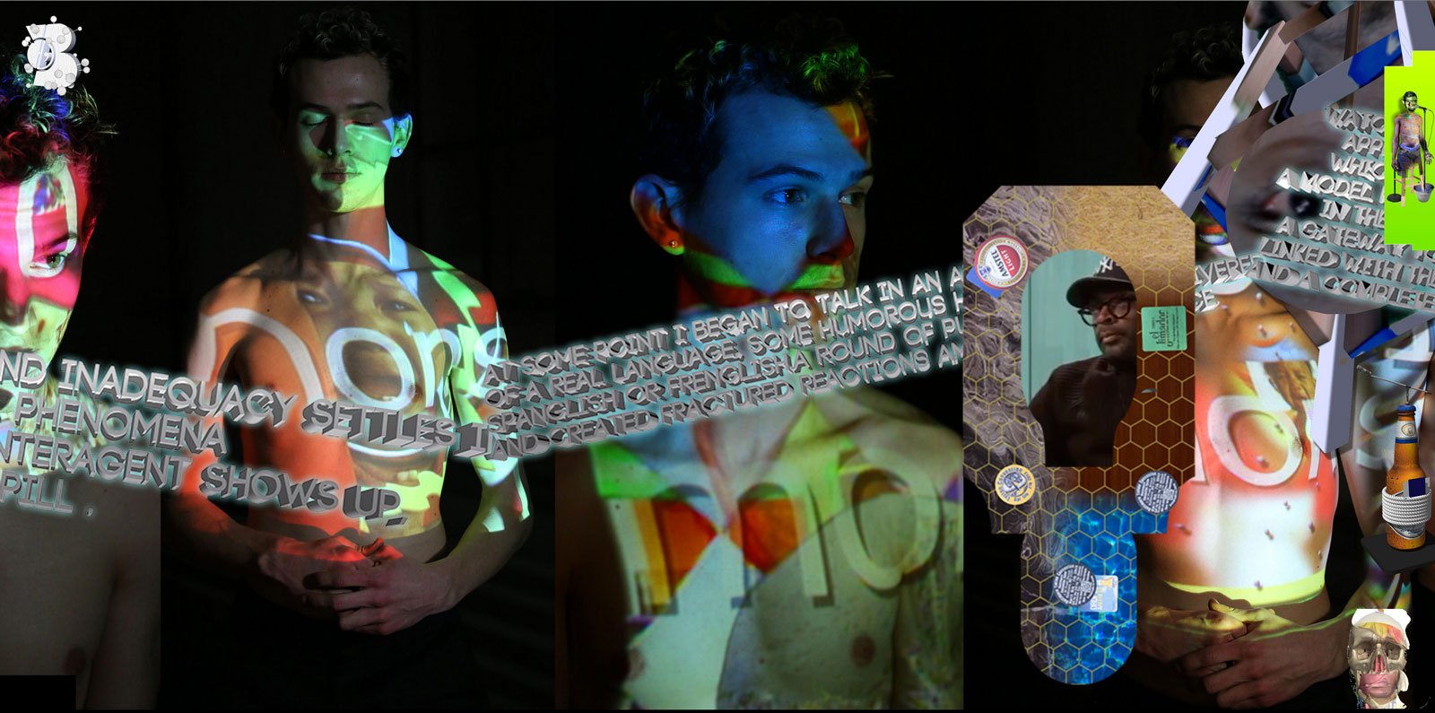
Screenshot of the Mick & Debra section of BOY’Dega: Edited4Syndication
2014
What was the role of New Museum in this project?
DANIEL: We reached out the them near the end of the project because we were looking for a way to launch the site, which is a big part of a project when you’re only making a website. So we contacted Lauren and she happened to be scheduling New Museum’s First Look Series. It was actually perfect because Artists Space had asked us previously to show at Frieze in May and Lauren wanted to release the website in May. We wanted to release season 2 at Frieze on the same day we released season 1 with New Museum. This was to create a binge watching experience like an Orange is the New Black situation.
Speaking of binging, I’m going to see Transformers tonight. That’s my big event for the day. It’s going to be three hours of pure torture.
MALCOLM: Because Shia Labeouf isn’t in this one? I always thought I would hate that franchise, but any time it’s on television, I will watch it. Even the Avengers and all the Marvel things, I super love.
They are so juvenile and crass and sexist and racist and homophobic and horrible and amazing!
DANIEL: I want to see Lucy and Planet of the Apes.
Planet of the Apes I hear is really good.
DANIEL: I liked the last one.
MALCOLM: I want to see Guardians of the Galaxy.
I have a friend coming over to use my A/C.
MALCOLM: Is it a dog or a fish?
Human this time, unfortunately.
MALCOLM: I hope this isn’t the only thing people think we do.
So what other things should we cover? Oh, what happened with your show that was planned in LA?
DANIEL: Did you see Nicki’s acceptance speech at the BET Awards?
![Screenshot from BOY'Dega: Edited4Syndication [Season 1] 2014](https://dismagazine.com/uploads/2014/07/boydega-edited4syndication-02.jpg)
