Christopher Williams: The 19th Draft
Keywords: Art, attention economy, Capitalist Realism, Catherine Taft, Christopher Williams, Commericial, David Andrew Tasman, David Zwirner, Eighteen Lectures on Industrial Society, Harun Farocki, institutional critique, machine for dreaming, Photography, Realism, Roxana Marcoci, The Production Line of Happiness
On The Production Line of Happiness and Eighteen Lectures on Industrial Society
Christopher Williams: The 19th Draft
![Standardpose [Standard Pose] 1,0 Zwerg-Brabanter, silber, Ddsseldorf 2013 (Vera Spix, Elsdorf) Ring number: EE-D13 13-901, green Studio Rhein Verlag, Düsseldorf November 21, 2013, 2014 Inkjet print on cotton rag paper 26 x 33 inches (66 x 83.8 cm) Courtesy David Zwirner, New York/London and Galerie Gisela Capitain, Cologne.](https://dismagazine.com/uploads/2014/11/WILCH0426_unframed1.jpg)
Standardpose [Standard Pose]
1,0 Zwerg-Brabanter, silber, Düsseldorf 2013 (Vera Spix, Elsdorf)
Ring number: EE-D13 13-901, green
Studio Rhein Verlag, Düsseldorf
November 21, 2013, 2014
Inkjet print on cotton rag paper
26 x 33 inches (66 x 83.8 cm)
Courtesy David Zwirner, New York/London and Galerie Gisela Capitain, Cologne.
In this DIS exclusive, Christopher Williams shares never before published work and insights on topics ranging from his resistance to calling his first U.S. survey show a ‘retrospective,’ to the feminist roots of contemporary photography, fire balls of liquified foam, and his upcoming solo show at David Zwirner Gallery — the 19th revision of Eighteen Lessons on Industrial Society. We think Bernadette Corporation’s John Kelsey said it best on a summer night at MoMA in celebration of Williams, “Is it Science or Pornography? Well, neither… it’s Photography.”
David Andrew Tasman: Can you tell us about the significance of the large red walls at the entrance to your first U.S. survey, The Production Line of Happiness, currently on view at MoMA?
Christopher Williams: Early on I felt uncomfortable with the form of a monographic retrospective that would focus on my accomplishments. The exhibition catalog ended up becoming a device that would allow me to run against that form, which I did by bringing in as many other voices as I could; the catalog as we published it has over 40 contributors. The red walls one sees at the entrance to the show are comprised of several enlarged pages from the book. These red walls take the place of the conventional biographical information, replacing it with a distinctly positioned narrative of production.
An early draft cover of the catalog had too much graphic information on it; wanting to clean it up, I inquired into what could be removed. Legally, as it turned out, the only information that had to be there was the bar code and a logo for each museum and distributor. I asked the publication department, “is the artists’ name really necessary?” And they said, “no, actually, but what artist would want to remove their name from the catalog?” To which I said, “you happen to be talking to him.” At that point I decided the catalog cover should have an informative function. The cover addresses the objectness of the book, not its contents. I left the required markings and then added descriptions next to them to explain their function. I like that in the bookstore the catalog is site specific or system specific—it actually discusses its status as a commercial object produced and distributed by the institutions represented on it.
At the onset of the installation of “The Production Line of Happiness” one encounters enlarged pages I selected from the catalog: images by Edward Weston, Thomas Struth, and one of my photographs, along with a page from an essay on my non-photographic production, architecture, publishing, etc. These images emphasize important references for my work; my relationship to straight photography, my involvement with architecture, or institutional critique. I’m not sure the term straight photography really exists anymore, but I think that mixing the idea of Neue Sachlichkeit or New Objectivity and the clarity which accompanies that kind of seeing—as can be found in the formal intelligence of someone like Weston mixed with the strategies of artists like Daniel Buren or Michael Asher, is the perfect introduction to my work.
Christopher Williams.
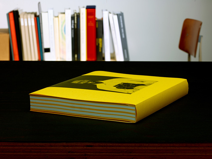
Printed in Germany
2014
Published by Buchhandlung Walther König GmbH & Co. KG
Ehrenstr. 4, D-50672 Köln
368 pages (4 pages cover, 8 pages dustcover, 16 pages
supplement, 128 color images)
Dimensions: 8 1/4 × 10 5/8 inches, spine width: 1 1/4 inch
Offset print, Euroscale (CMYK)
3 editions: yellow, red, green
Paper stock: cover: Munken Lynx 400 g/qm, dustcover: Papyrus
Rainbow Color 160 g/qm, colored stock: Papyrus Rainbow Color
120 g/qm, chapter pages: Papyrus Rainbow Color 230 g/qm,
image pages: Scheufelen BVS (white, matte) 170 g/qm,
supplement: Papyrus Rainbow Color 160 g/qm and Scheufelen
BVS (white, matte) 170 g/qm
Graphic Design: Petra Hollenbach
Lithography: Bernd Montag
Printed by Artnetworx, Hanover
ISBN 978-3-86335-600-2
Photo credit: Rhein Verlag
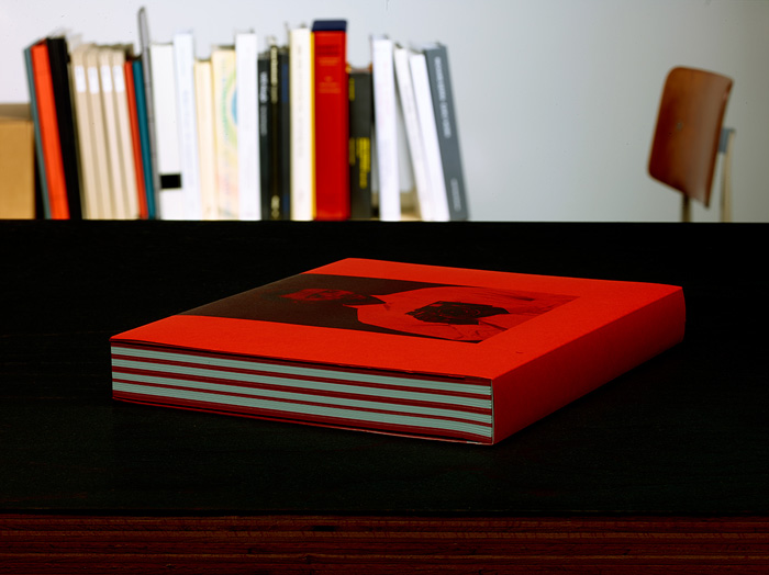
Christopher Williams. Printed in Germany
2014
Published by Buchhandlung Walther König GmbH & Co. KG
Ehrenstr. 4, D-50672 Köln
368 pages (4 pages cover, 8 pages dustcover, 16 pages
supplement, 128 color images)
Dimensions: 8 1/4 × 10 5/8 inches, spine width: 1 1/4 inch
Offset print, Euroscale (CMYK)
3 editions: yellow, red, green
Paper stock: cover: Munken Lynx 400 g/qm, dustcover: Papyrus
Rainbow Color 160 g/qm, colored stock: Papyrus Rainbow Color
120 g/qm, chapter pages: Papyrus Rainbow Color 230 g/qm,
image pages: Scheufelen BVS (white, matte) 170 g/qm,
supplement: Papyrus Rainbow Color 160 g/qm and Scheufelen
BVS (white, matte) 170 g/qm
Graphic Design: Petra Hollenbach
Lithography: Bernd Montag
Printed by Artnetworx, Hanover
ISBN 978-3-86335-601-9
Photo credit: Rhein Verlag
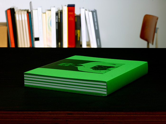
Printed in Germany
2014
Published by Buchhandlung Walther König GmbH & Co. KG
Ehrenstr. 4, D-50672 Köln
368 pages (4 pages cover, 8 pages dustcover, 16 pages
supplement, 128 color images)
Dimensions: 8 1/4 × 10 5/8 inches, spine width: 1 1/4 inch
Offset print, Euroscale (CMYK)
3 editions: yellow, red, green
Paper stock: cover: Munken Lynx 400 g/qm, dustcover: Papyrus
Rainbow Color 160 g/qm, colored stock: Papyrus Rainbow Color
120 g/qm, chapter pages: Papyrus Rainbow Color 230 g/qm,
image pages: Scheufelen BVS (white, matte) 170 g/qm,
supplement: Papyrus Rainbow Color 160 g/qm and Scheufelen
BVS (white, matte) 170 g/qm
Graphic Design: Petra Hollenbach
Lithography: Bernd Montag
Printed by Artnetworx, Hanover
ISBN 978-3-86335-602-6
Photo credit: Rhein Verlag
Catherine Taft: It seems very clear that the catalog’s language adopts the language of its own production. Surprisingly, some reviews of the first installment of “The Production Line of Happiness” alluded to a spirit of obfuscation in the show—for example, the wall labels being dislocated from their work—which prompts me to ask if there is a degree of illegibility operating in your work, either intentionally or not?
CW: Illegibility? No, I am actually not interested in that idea at all, although the idea of disarticulation and methodologies of separation are of great interest to me. With regard to the book, I can’t imagine one that is clearer about its economic and material realities.
The history of photography as art in the 20th century is the history of the illustrated press or the photo book, and no one stands as a better example of this than Walker Evans, who embraced the roles of photographer, editor, graphic designer, typographer, and copy writer. In his books, but especially his magazine work, no one element took dominance over the others. In fact, he used each element as a device to open up rather than reduce the possibilities of the entire network. Evans possessed an acute sense of context and many times used his position within a publication to criticize the ideology of its support structure. Making the jump to the context of exhibition and gallery display, it’s of course easy to think of the photographic practitioner extending their role to that of the curator, exhibition designer, etc.
Two things should be noted: Evans was criticized for the physical distance between his photographs and his texts, and it is well known that he locked himself in the Museum of Modern Art to arrange his own pictures, sometimes wheat pasting them to the walls so that they could not be moved.
DAT: Evans’ forms of dissent are nice analogues to your catalogue, especially thinking about it for sale within the museum bookstore. There, with its explanations of the systems it participates in on its cover, it becomes something of a wolf in sheep’s clothing. It also provides a good model to understand the pictorial intelligence of many of your works, which often allow the forces that establish societal norms and expectations within a given mode of production to inflect or appear within them. In that way, many of your images have the capability to disrupt the populations of imagery they categorically may reside in. For example, I’m imagining Meiko Smiling amongst a google image search for ‘beauty’ or one of your gelatin silver prints from Angola to Vietnam turning up in a search for 1-800-flowers.
CW: I am trying to articulate systems, but I am also trying to slow them down. For example, I move into a system of production to separate the key elements—to push them apart—so I can understand their relationship to each other and how they function. That process gives me the insight to reassemble the elements to become useful in a new way for a different audience or for my own agenda, but also so that they reflect on their normal usage or function.
The idea is to get inside the mechanics of convention and to push the parameters to make those mechanics visible or to repurpose them; to make them useful to our time, and place them in relation to the history of those conventions to both criticize and comment on them. I am not deconstructing history, but identifying what is useful in it now through a photographic way of seeing, and using that way of seeing to isolate and describe.
My position in relationship to production is conventional but decentered. Imagine holding your finger over a text on your iPhone so that the cursor becomes a magnifier enlarging the area under your finger. This is a good image for the way that I move through types of production. At any one point I may choose to amplify just one element, or two elements, but within the show things accumulate into networks of focus within something that at first appears to be just a conventional display of pictures.
I can’t help but think of a mysterious filmmaker I read about as a student named Eugene von Gundlach. Gundlach made Socialist nature films in the ’60s during Communism’s reign in Eastern Europe, asking questions like “Is a Socialist deer in East Germany different than a deer in the West?”
Gundlach became a legend—not because he would later go to Cuba to document hummingbirds, Socialist hummingbirds, which he did do—but because when he did leave for Cuba in 1970, he knew that he could not take his camera. And so, as the story goes, he completely disassembled the 16mm Arriflex and sewed the pieces inside his clothing. At the same time he made photographic documents and audio recordings of the instructions for how to put the camera back together again. When he arrived in Cuba he discovered he had lost some parts during his voyage. The reason why he is a legend is because, undeterred, he set off for a machine shop and made the missing parts necessary to fix and reconstruct the camera, and then went on to make his film Socialist Hummingbirds in Cuba.
For years I did not even know his name, it was only recently that someone told me his name was Eugene von Gundlach. This is where things get interesting for me, because one of the most famous German fashion photographers from, say the 1950s on, was a photographer named Franz Christian Gundlach, known as F.C. Gundlach, who among things took pictures of Nico before she was Nico—when she was a fashion model.
What I find so fascinating is the incredible parallel here between a high-capitalist photographer and his doppelgänger, a mysterious Socialist nature-documentary filmmaker from some Socialist country in Eastern Europe.
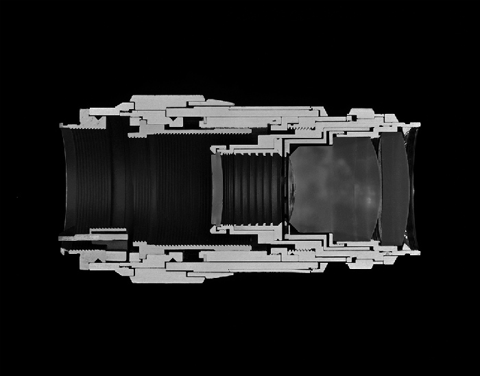
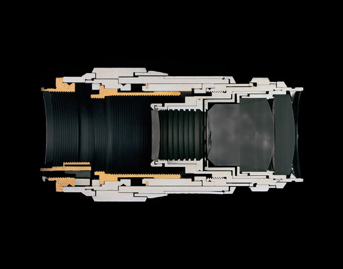
Christopher Williams
Cutaway model Leica Leitz Wetzlar Tele-Elmar 135/4.0
Focal length: 135 mm
Aperture range: 4 – 22
Number of elements/groups: 4/4
Focusing range: 1.5 m – infinity
Angle of range: 18 degrees
Filter thread: 39 mm
Weight: 405 g
Dimensions: 53.4 × 122.69 mm
Manufacturer part number: 11850
Lens design by Dr. Walter Mandler
Manufactured by Ernst Leitz GmbH, Wetzlar, Germany
Studio Rhein Verlag, Düsseldorf
March 14, 2013, 2014
Selenium toned gelatin silver print
14 1/2 x 18 1/2 inches (36.8 x 47 cm)
Courtesy David Zwirner, New York/London and Galerie Gisela Capitain, Cologne.
CT: These strategies move way beyond traditional institutional critique to construct a sophisticated commentary on image formation and circulation, and on social, political, industrial, and aesthetic histories as well.
DT: It is easy to see now both Gundlach One and Gundlach Two within your practice, especially when thinking about the way the former disassembles and documents his camera in relation to the way you describe your approach to the mechanics of production.
CW: In the case of photography, you might say that both Gundlach programs guide my hand. It would not be misleading to say that my rooster is the product of German reunification. One has a very simple model of production: a subject in front of the camera and a subject operating the camera. And it is the relation between those two points that has become the focus of traditional photographic discourse. However, the production of the image also includes the equipment, the lights, the technicians and assistants who supply the power and keep everything on track. Then, within the camera itself, you have chemical, mechanical and electromagnetic centers. And when examining the conventions of presentation, one discovers the matte, the frame, the gallery, the sequence of images, the history of the space, etc.
An important component, too, is the spectator or user, who mirrors the photographer. On any place one focuses within the photographic system there is an entire network of possible points to define. These multiple centers are what I am trying to describe in the story about Eugene von Gundlach and F.C. von Gundlach – and within “The Production Line of Happiness” as well.
CT: The artists considered part of the Pictures Generation, many of whom attended CalArts a few years ahead of you, turned to appropriation as a polemical act, which was a break from the first generation of conceptual artists who used photography in a purposely deskilled manner. For that second generation, was there a key moment when being an artist using photography took on a significant difference? I’m thinking specifically of the difference between those artists taking a picture versus making a picture.
CW: My Kennedy works, which are photographs of someone else’s photographs, are from that period. At the time even the choice of using photography as an artistic medium was an inherently political one. For example, when I chose to work photographically I felt that I was siding with the many women artists I was interested in who had also chosen to work photographically, such as Barbara Kruger, Louise Lawler, Barbara Bloom, Sherrie Levine, and Sarah Charlesworth. These were all very powerful, very interesting women who were using a medium that was being overlooked by other people in order to construct their discourse.
At that time there was a resurgence of painting that was closely associated with the romanticized image of the artist as a genius, and far too often a male genius at that. My photographic appropriations were both a form of resistance to that trend and an act of solidarity with other likeminded artists.
However, I would soon realize that I had to distance myself from re-photography and de-skilling to make a space for my own voice as an artist. It wasn’t strategic. I had simply lost interest in the flat space of the re-photographed photograph and I wanted to engage with space in a different way. Around the time that John Baldessari was making a series of work which incorporated science photography, film stills, fashion photography, product photography, and journalism, there was a moment when I realized that instead of appropriating the photograph I could just pull the whole system back and appropriate the entire site of production—including the studio and studio technicians—rather than appropriate the image itself. I discovered through that strategy that it was no longer necessary for me to operate the camera. In fact by occupying the role of the director I gained much more control over the content of the image, and a more productive relationship to the three-dimensional space in front of the camera.
Christopher Williams
Interflug Model: Iljuschin IL-62
Flight number: IF 882
Departure: 3:30 pm, SXF – Berlin Schönefeld, Berlin,
German Democratic Republic
Arrival: 5:40 pm, ALG – Houari Boumediene Airport, Algiers,
Algeria
Sunday, August 28, 1983
Studio Rhein Verlag, Düsseldorf
October 21, 2013, 2014
Inkjet print on cotton rag paper
14 1/2 x 18 inches (36.8 x 45.7 cm)
Courtesy David Zwirner, New York/London.
Courtesy David Zwirner, New York/London and Galerie Gisela Capitain, Cologne.
CT: I was recently reading the catalogue of your 1997 show at the Museum Bojimans Van Beuninger in Rotterdam. Tim Martin wrote that your photos take into account the space around them. I really see that in the installation at MoMA, and also in the spaces and sites of your other exhibitions.
CW: My relationship to space tends to change depending on what model of photography I happen to be using at the time. While making The World Is Beautiful, I was experimenting with a model of shooting where I was trying to make the conditions of production palpable within the photograph but not visible.
I had been thinking in general about the realities of studio portraiture, and specifically about Thomas Struth’s portraits, which are made using a process where the amount of time required to produce a studio portrait with a large format camera often far exceeds a novice subject’s expectations. So, to acknowledge this under-articulated reality—in the photograph of the Korean women, for example—I chose to depict the expression and posture of fatigue and boredom that not many people know accompanies a large format studio shoot.
Roughly 10 years later, by the time I started Eighteen Lectures on Industrial Society, I had the sense that I was getting too comfortable with my program and desired to change the work. In order to keep my explorations of certain interests, genres, and issues productive, I decided to invert their relationship to the frame. Rather than just imply the presence of the apparatus from outside the frame, I brought it right into the center. That is when the camera first appeared as a subject in the work—and when the consciously posing models first appeared, as well as the three-point reflection guides, power-packs and softboxes—all of which I would make visible within the frame. While I personally remain outside the frame, there are several works where the models within the frame are intentionally captured while addressing me, usually smiling, laughing, or talking.
CT: On that topic, I’m thinking about Meiko Smiling and how you almost set that up according to Jacques Tati’s casting call for Playtime. Reading the call, I came across a quote by Leonard Maltin that said, to paraphrase, “Tati could get a laugh out of the hum of a florescent light bulb.” He really knew how to create a humorous situation out of the most basic, mundane things. I find a lot of your work very pleasurable and funny. Perhaps it’s because I have an understanding of West Coast conceptual art and the lineage of makers who weren’t beholden to the seriousness and gravity that you describe within the tradition of European conceptual art. Coming at this question from another direction, I read, in the catalog, the transcript of your lecture on John Chamberlain where someone in the audience asks a question about humor, to which you reply, “I don’t have a sensible relationship to humor.” I wondered what your relationship is, in that case?
CW: I wonder if that’s a typo because what I would want to say is “I don’t have a sense of humor.” It is just something I have no feeling for, and not only do I not understand jokes, I derive no pleasure from listening to them.
CT: I don’t buy that.
CW: No, I think that if you find my work funny, I want to say “Do I have clowns on my face or something?” It’s a little like when you walk into a party and everyone laughs at you, it’s a drag.
CT: Oh I’m not laughing at you! There’s just levity in certain images.
CW: I think that humor is a little bit like the idea of punctum. I think it only works when it comes in sideways or through the back door. I think the worst thing one can do is have a show called “Humor in Art” because then one is guaranteed to walk in and say “This isn’t funny.” Right? But when something is unintentionally funny—this also happens contextually—I always think it’s great, for instance, when walking through a museum, one sees Mondrian and things like that, and then has an encounter with Ed Ruscha. All that metaphysical speech just gives way when encountering 75% Evil 25% Good or one of his paintings like that, and one can’t help but smile. At the moment I’m working on an outline for my class at the Kunstakademie Düsseldorf devoted to the work of Sid Ceasar.
Christopher Williams
Untitled (Study in Gray)
1967 Citroen DS
Serial number: DS851360a
Color code: AC 226
Color name: gris satiné
Color year: 1964
Studio Rhein Verlag, Düsseldorf
November 3, 2013, 2014
Inkjet print on cotton rag paper
20 x 25 inches (50.8 x 63.5 cm).
Courtesy David Zwirner, New York/London and Galerie Gisela Capitain, Cologne.
DAT: There is a Martin Kippenberger quote where he says that to “simply hang a painting on the wall and say that it’s art is dreadful. The whole network is important!” David Joselit, who I studied art history with at Yale, mentions this in his essay “Painting Beside Itself” as the most important problem to be addressed on canvas since Warhol. It seems appropriate to bring this concept up in relationship to Meiko Smiling, where you expose the commercial model through which the photograph was produced as form of mass instruction regarding ideals—in this case on beauty, happiness, or cleanliness—that a certain population within society aspires towards. But by including the three-point reflection guide, you reveal that it is a constructed image, that the naturalness is artificial and just one part of a network of advertising production, and by proxy, as a fake, the model is unrealistic—unattainable even—in daily life.
CW: I definitely address the production, reception, and distribution of photographic information, which is what I think the show and the exhibition catalogue engage with—through the idea of models, and the adoption of models.
We’ve discussed two models already, the first about making the system of production palpable within the image, and the second about making the system of production visible within the image. An idea that is very interesting to me right now is to adopt a model and stay as closely as possible to that model. The idea of staying close to the model is not necessarily to produce a type of image, but to adopt a way of seeing, or to inhabit a way of seeing. This is one of the reasons why I started working with other people to make photographs: it allows me to get inside the way a product photographer thinks or a fashion photographer thinks, to inhabit or experience a different type of sight.
If you look at the apples, they are very close to their model. What I was interested in was their visuality—and I wanted to get inside it and intensify it, to increase the level of detail. For me, what that does is extend the time that a viewer will look at the image by intensifying their relationship to it visually. It is a way of seeing that promotes a very close, very specific kind of looking, a kind of suspended attention creating the context for the suspended meditation on the possibilities of pictorial form. The original model was a photo in the grocery store in my apartment building. I was walking around my neighborhood thinking about what I wanted to make, when I went in and saw apples, and I saw socks, Falke socks.
I was aware of the fact that this is iconography that Sigmar Polke, Gerhard Richter, and Konrad Lueg all used in the same geographical region but at another time. That dialectical relationship allowed me to reframe Capitalist Realism through the present day. I am interested in closing as much of the distance as possible to the model that I am using to produce the images, as a way of intensifying its position within art and also as a way of bringing the kind of rarefied perception associated with an art work into alignment with a vernacular way of seeing.
Another model I use is montage. In a single photographic print I collapse many elements into the frame, and hopefully—and importantly—the various histories and ways of seeing that each element suggests. In my photo of Zimra Geurts, who was the Playboy Netherlands Playmate of the Year in 2012, there are references to Guy Debord’s Society of the Spectacle, in which automobiles, women in bikinis, and topless models appear; as well as references to Harun Farocki’s film Ein Bild, which is about a Playboy centerfold shoot in Munich in the 1970s. Farocki’s film is really about the labor that goes into constructing an image, in that case one associated with male pleasure. The diagonal strip that says “Balcar” is a representation of the soft box light that was used in the Farocki film. Of course the stripes on the strandkorb konsul [beach chair], relate to the artist Daniel Buren. So what comes together in this picture is a montage of several elements: Playboy, Buren, Debourd, and Farocki. Farocki has a strong place in that picture, stronger than I thought he would, but I think my picture gets to a different place than his film. I think Zimra has a different function in my picture actually, a more active function.
CT: She has agency.
CW: Yes, she does.
CT: Her pose—with her shoulders pushed forward to accentuate the collarbone area—is one often used by waif-like editorial models. In your picture, Zimra is captured striking this pose while laughing at the camera or even the voyeur. Her laughter appears subversive, as she, after your own appropriation strategies, appropriates a form not typically included in a playmates repertoire to reveal something about the influences that produce mass expectations of femininity. Zimra’s awareness of the power structures in operation adds additional depth and complexity to the picture.
CW: Exactly, It’s not only about the economy of her body, but also about her creating the opportunity to produce a new unexpected instructional model in the place where the viewer expects to encounter a familiar stereotype.
DAT: Harun Farocki often used corporate or state-produced ‘instructional’ videos as a way to examine the power of the constructed image or of video to influence and control our behavior. However, when you make images like Loading the Film or Changing the Shutter Speed, both part of a series inspired by the camera instructional, what else is going on?
CW: With the recent passing of both Harun Farocki and Allan Sekula we have lost two of our most intelligent and critical voices.
In Loading the Film and Changing the Shutter Speed, the model was a camera manual demonstrating how to use the basic functions of the camera. In order for the manual to function as a kind of program, the diagrams within it need lots of notes and arrows to articulate the directionality of the fingers, almost like the score for a dance or a play. This choreography demonstrates the way in which the camera objectifies its users, transforming them into functionaries. By removing the arrows and diagrammatic aspects, the work takes on a different kind of openness—different tenses, in a way. Sometimes I moved the fingers closer; other times I took them away so that you don’t know if the action has been performed or not performed. Rather than slavishly reproduce the model, these images not only shift time frames but narrative frames as well.
I also use a model of “bad composition,” which is another strategy to shift frames and avoid the problems encountered making pictures around the notion of the “decisive moment.” An example might be a project where I took for a subject the stool that was used in the ’72 Venice Biennale by Michael Asher, who I was assisting at the time. It was a Danish modernist folding stool, and Asher set about 20 of these up at the end of the exhibition as a place where people could sit and talk about what they had seen. I found two images from advertisements of the stool where you could kind of say the composition was “traditionally perfect” or “classically perfect.” I then made 11 photographs of the stool, rotating it slightly in front of the camera after each shot. The seat of the stool is supported by an x-form, and as I rotated it what had appeared as a strong symmetrical shape became unstable and awkward.
DAT: In quantum physics there is a theory that the sheer act of observing a particle can have an effect on the particle. In a way, you’ve modeled this as an approximation where the act of observation has a destabilizing effect.
CW: Science and art are filled with people who make the same discoveries at the same time.

Christopher Williams
K-Line
Matt Dulling Spray
CFC Free
Applications
– Photographic
– Motion Picture
– TV Studio
Removes Glaring Highlights from Polished Surfaces in Camera Work.
Coats evenly with a very fine spray pattern – it effectively dulls any polished object to be photographed.
Directions
Shake the can well, and whilst spraying, hold not more than 30 cm (12 inches) from the object.
The spray sets in about 2 minutes, and further coats may be added if necessary.
It wipes off easily with a soft cloth and all smears can be removed with a little spirit.
K-Line spray is safe with most materials, but a test should be made on a scrap surface if in doubt, especially with some types of plastics.
Caution
Pressurised container.
Protect from sunlight and do not expose to temperatures exceeding 50º C.
Do not pierce or burn even after use.
Do not spray on a naked flame or any incandescent material.
Keep away from sources of ignition – No Smoking.
Keep out of reach of children.
Do not breath spray.
Avoid contact with eyes.
Use only in ventilated areas.
Store at a minimum of 20º C
UN 1950
Extremely Flammable
2827
S W Kenyon
Cranbrook – Kent U.K.
Division of K-Line Photographic Supplies Company
Telephone: 01580 850770
Made in Britain
Registered in the US Patent and Trademark Office
Studio Rhein Verlag, Düsseldorf
August 24, 2014, 2014
Inkjet print on cotton rag paper
27 1/2 x 22 inches (69.9 x 55.9 cm)
Courtesy David Zwirner, New York/London and Galerie Gisela Capitain, Cologne.
DAT: Did your ideas about exhibition-making go through a similarly radical shift? In his essay “Section Publicité,” Mark Godfrey [Curator of International Art at Tate Modern and the organizer of the next installment of The Production Line of Happiness at Whitechapel in London] describes your reaction when your MFA show, Source, was confiscated by the U.S. Customs House on its return from the Vienna Secession. He cites this as a pivotal moment leading to your discovery that just as with an individual work of art, one can nominate an entire exhibition a “Duchampian readymade.” What did he mean by that?
CW: Shortly after the Kennedy work had arrived back from a group show I was in with Mark Stahl, I received a notice from the U.S. Customs House stating that 88 pounds of photographic material had been included with other abandoned material and would be going up for auction. Mark Stahl and I were both attracted to the reductive language used to describe our work. We were right out of art school and had a lot to say about what we were doing. We decided to take advantage of the government’s reduction of our work to “88 lbs of photographic material” and adopt it as the title of our exhibition. Upon our arrival, we found the crated Kennedy work amongst several hundred lots of abandoned merchandise that included a stuffed marlin, parts from old Xerox machines, tires—anything that hadn’t been picked up on its arrival to the U.S. Customs House. What was of interest here was the whole system of distribution and display. This represents a shift in thinking from the object to the form of the exhibition as the primary object.
DAT: The conditions of display seem to have remained a crucial aspect of your practice—one that often receives as much consideration as the work itself. In your current survey, both major bodies of work on view, The World Is Beautiful, followed by Eighteen Lectures on Industrial Society, are unique in their pictorial intelligence but share the serial condition of having been exhibited in various iterations over decade-long cycles. These iterations become very episodic—almost as if they were conceived as individual episodes of the same television program. Could you elaborate on the relationship here between the part and the whole?
CW: What you were just calling “episodes,” I call “ drafts” or “revisions.” Since I began The World Is Beautiful, I’ve thought about the exhibition and the individual works within the exhibition as both a text and elements within a text that can be revised to change their nature, as one can do in a re-write, or by creating a new edit of a film.
However, in thinking about the term ‘episodic,’ it reminds me that early in his career the American comedic television host David Letterman used to tap into the live feeds of other television studios adjacent to his own – news shows, for example, where they would leave the cameras and lights on during the breaks when they switched briefly from “On Air” to “Off Air”. Letterman would show his audience a newscaster from an adjacent studio just sitting there, waiting for something to happen. That was really important to me for a couple of reasons. One, because the model, unaware and therefore unconcerned with the camera, became an area of interest. And two, Letterman’s use of material from another studio in the building, specifically his presentation of what the camera sees when the audience isn’t looking—when the cameraman isn’t looking—was really important to me.
DAT: This reminds me that in After Art, writing on Sherrie Levine’s Post Card Collage #4, David Joselit explores the role “discrete objects” can have in manipulating the “populations of images” they are contained within in order to reveal their “framing networks” and to stage a “performative mode of looking” where the “single image and the network are visible at once.”
CW: This is a good parallel to what I was trying to describe by talking about re-writing a text or editing a film. Pretty early on in my work you can see a concern with the performative, sculptural displacement, and the distribution and circulation of commodities. Photographs exist as autonomous units with their own history and their own narrative, but within a group there is also a tension between them: this is what makes considering them as flexible, changeable units within a larger group of images super interesting to me.
CT: It is interesting to hear you tie the installation to writing and editing because, reading your catalogue, there is a sense of repetition and rupture created by the amount of contributors and the content. I found it totally engaging and exciting. In the catalogue, you include a series of press releases from past exhibitions with a repetitive quality that creates a play with language—something that occurs, for instance, when the word ‘release’ is presented over and over again. To me, I read these like poems, and they made me want to try to locate the poetics or verse in the images themselves; does that character reside more within the catalogue alone or does it extend to the exhibition—maybe it’s a stretch—but perhaps as some type of concrete poetry?
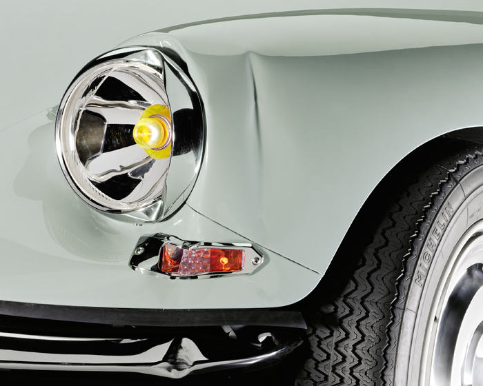
Christopher Williams
Untitled (Study in Gray)
1967 Citroen DS
Serial number: DS851360a
Color code: AC 138
Color name: gris dandy
Color year: 1966
Studio Rhein Verlag, Düsseldorf
November 7, 2013, 2014
Inkjet print on cotton rag paper
20 x 25 inches (50.8 x 63.5 cm)
Courtesy David Zwirner, New York/London and Galerie Gisela Capitain, Cologne.
CW: There are interesting things to talk about in your question in terms of poetics and writing. Roxana Marcoci [Senior Curator in MoMA’s Department of Photography], who I worked with on the show, contributed an essay to the catalog for “The Production Line of Happiness” that does a very good job of talking about my work in relationship to films that engage with the essay form, or the idea of the filmmaker as essayist. In her piece she writes about the influence of Chris Marker, Jean Luc Godard, and Jean Rouch, among others. Roxana also invited me to organize a cycle of screenings at the museum as part of their Carte Blanche series. I feel very close to the thinking of the artists mentioned in the essay and those who we featured in the screenings. They were artists who were really important to the formation of my thinking.
One of the things that interests me is the idea of the documentary film that exceeds its documentary function—or the instructional or educational document that exceeds its function—and in doing so, attains something like a poetics. Take, for example, a structural materialist work that in its documentation of its own existence, exceeds that description. A lot of structural film that sets out simply to describe its own materiality takes on a certain kind of poetics.
I like the idea of something being so specific and so descriptive that it takes on a kind of poetics, because the space created by the play between the essay or documentary and the idea of the poetic is a place that I feel very comfortable in. For example, included in the catalog is a talk that I gave at Dia about John Chamberlain where I talked about his foam sculptures. It runs parallel to Roxana’s essay in a way that addresses your question, I think.
I tried to start my talk about John Chamberlain by making reference to both Francis Ponge, the French poet who wrote frequently about art, and John Fahey, the guitarist and composer. What I tried to do was use their voice and their type of production to reframe John Chamberlain’s production.
The works of Chamberlain that I addressed in my talk were his sculptures made of foam rubber—which I felt had taken on the role often fulfilled by the documentary essay, and as sculptures also functioned as essays on the characteristics of foam rubber. Looking at the works, you can see the way Chamberlain used cords or tools to demonstrate that the foam is malleable; you can see what happens when pressure is exerted, or when you cut into the material. In those works you can also see the industrial markings such as bar codes and logos imprinted on the material in concert with its distribution. In addition, many of the foam pieces also reveal what happens to foam rubber when it ages.
Chamberlain was a real materialist. He was an essayist in foam, and those pieces are real material essays on the quintessential 20th century material. I have a picture of one of Chamberlain’s foam pieces in the exhibition that I hope does the same thing. While a lot has been written about modernism, about steel and glass and concrete, very little has been written about foam.
There are times when I hope my work at least has a historical function. So that if in the end, people say “Well, in his art he was pretty marginal and pretty un-interesting, but if you want to know what the 20th century looked like, what the material in all those chairs looked like, he made the best picture of foam rubber that ever existed, and it looked like this—these are its properties and characteristics.”
The same thinking is behind my reference earlier to the French poet Francis Ponge. In his book Soap, Ponge goes through several literary genres to discuss the basic properties of soap—which is actually very similar to the structure of foam rubber when you work it into a lather—which is why I wanted to bring those figures parallel to one another. I have no idea if Chamberlain read Ponge; I assume that he knew of him as he was a well-read man. The structure of the Chamberlain talk became the model for the entire catalog. It is worth noting that in a plane crash it is very likely that what will kill you is a fireball moving at a high speed, back and forth the length of the aircraft, this fireball being comprised of liquefied foam rubber.
Christopher Williams
Cutaway model Leica Leitz Wetzlar Tele-Elmar 135/4.0
Focal length: 135 mm
Aperture range: 4 – 22
Number of elements/groups: 4/4
Focusing range: 1.5 m – infinity
Angle of range: 18 degrees
Filter thread: 39 mm
Weight: 405 g
Dimensions: 53.4 × 122.69 mm
Manufacturer part number: 11850
Lens design by Dr. Walter Mandler
Manufactured by Ernst Leitz GmbH, Wetzlar, Germany
Studio Rhein Verlag, Düsseldorf
March 14, 2013, 2014
Selenium toned gelatin silver print
14 1/2 x 18 1/2 inches (36.8 x 47 cm). Courtesy David Zwirner, New York/London and Galerie Gisela Capitain, Cologne.
DAT: In that scenario, in the blink of an eye foam transitions from innocuous to dangerous, like a material form of an auto-antonym or contronym, where both meaning and it’s opposite reside in the same form, such as in the english word ‘custom’ which can mean both common and special-ized. This material sublimation reminds me of Rem Koolhaas’ essay, “Junkspace,” where he points to modernism’s failed promise of a machined aesthetic by describing the reality of our pre-sent day material culture through an inventory of those things that make up the majority of its components—the artificial and composite materials, the tapes, the glues and fasteners. I also no-ticed that Rem Koolhaas is a contributor to your catalog, and in thinking about the variety of sys-tems that have been the subject of many of your works—the walls, the windows, the cameras—it appears that you and Koolhaas share a lodestar.
CW: I think that is a nice parallel. Koolhaas’ contribution to the catalog was not a finished product, it was a draft of a proposal for the Venice Biennale of Architecture for an exhibition called “Elements” that had not yet occurred at the time of his submission. On the other hand, the catalog includes Claes Oldenburg’s description and budget for The Store, a project executed 50 years ago.
The inclusion of texts from both past and future projects could be seen as analogous to the way I approached the exhibition design for the MoMA show, using walls from the distant past, walls from the recent past, and walls for future exhibitions simultaneously, as a general context for the exhibition.
For example, the cinderblock wall in the show is a wall I’ve had built and is a reconstruction of the wall system used in Whitechapel gallery in London, where the show will travel to next. In my research into the wall system I discovered that Jackson Pollock, Rauschenberg, and Rothko—among many others—did shows where they hung their paintings on cinderblock walls, because they’re cheap and quick. I decided in the last area of the show to have a kind of preface to a future wall so that you have this kind of rhythmic string of wall discourse running through the exhibition.
An essay in walls and pictures.
CT: Will you take the other wall fragments to Whitechapel when the show moves there?
CW: We’re hoping to, and I shouldn’t say more, but let me just say that I’m reminded of a painting by Winston Churchill called Custody Battle in which two large palm trees are seen fighting over a smaller one. Some walls’ mothers are bigger than other walls’ mothers.
DAT: So the cinderblock wall on display at MoMA is in the future tense, as a sort of physical, projective blueprint from the upcoming show? Roxana tells me that over 20 walls (not counting your photographs of walls) have been built or brought to the space, and that several others also have a special significance.
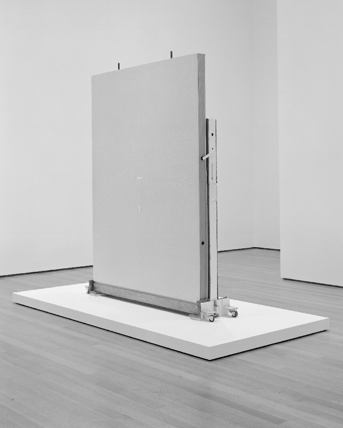
Christopher Williams
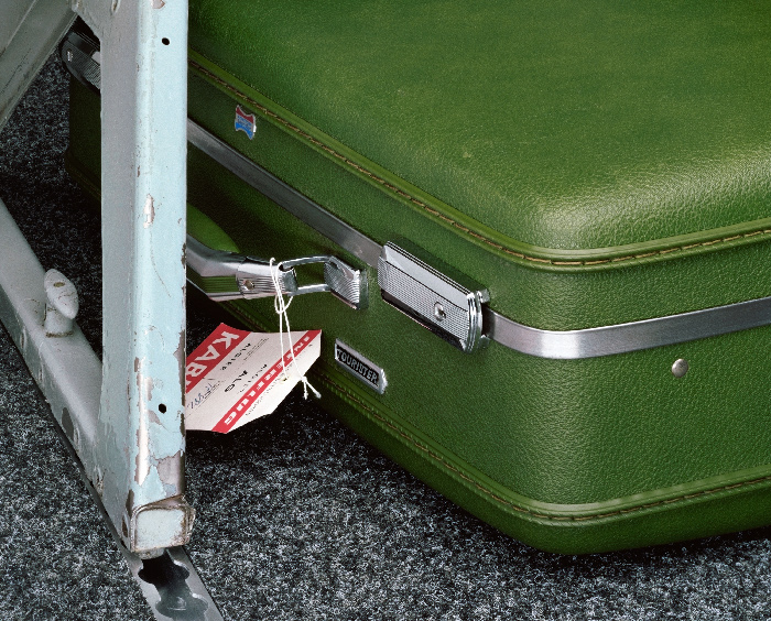
Demountable wall panel with panel storage cart from the exhibition The Production Line of Happiness, Art Institute of Chicago, Chicago, January 24 – May 18, 2014
Wall panel materials: Oak, plywood, metal, cardboard, fabric, rubber, vinyl, and adhesive
Wall panel dimensions: 102 x 72 x 4 1/2 inches
Storage cart materials: Steel, carpet, rubber, plywood, and paint
Storage cart dimensions: 78 x 86 x 18 inches
Gallery display system designed by Skidmore, Owings & Merrill LLP (SOM), Chicago, 1982
Pedestal materials: MDF, plywood, Douglas fir blocking, screws, lag screws, neoprene rubber spacers and shims, and metal
Pedestal dimensions: 134 1/2 x 66 1/2 x 4 3/4 inches
Pedestal designed by Mack Cole-Edelsack,
Department of Exhibition Design and Production, The Museum of Modern Art, New York, in accordance with loan specifications from the Art Institute of Chicago, Department of Photography
Exhibited in The Production Line of Happiness, The Museum of Modern Art, New York, July 27 – November 2, 2014
July 20, 2014, 2014
Selenium toned gelatin silver print F
22 1/2 x 18 1/2 inches (57.2 x 47 cm)
Courtesy David Zwirner, New York/London and Galerie Gisela Capitain, Cologne.
CW: At MoMA the exhibition design and the photographs collaborate to present several tenses at once through a collapse of time and space over three separate zones, which I wanted to delineate without building overly defined rooms. The zones are then stitched together by the low center of gravity of the images.
I also had the idea of contrasting tall vertical forms with shorter squatter forms. The vertical forms are walls that are typically paired with references that point to MoMA itself. For instance, those are the locations where the red vinyl graphic enlargements from the MoMA catalog are displayed. Additionally, I have left a tall vertical fragment of a blue wall from Gauguin’s “Metamorphoses” exhibition that occurred in the room just prior to “The Production Line of Happiness.”
Of the shorter walls I’ve installed at MoMA, in addition to the wall from Whitechapel, are two others from an exhibition in Chicago. Both came from the photo department in the basement of the Art Institute. It is part of a wall system that was developed in the early ’80s by Skidmore, Owings & Merrill, specifically for the photo department there. I’ve worked with mobile wall systems for several years, making pictures of them, and in the past it was a common thing for photography—both in art schools and in museums—to be in the basement, which reflected the hierarchical value of the medium at the time. Although photography’s status has changed for the better, in Chicago we decided to bring one of the walls up from the basement to be with the rest of the show; for the second installment at MoMA we brought two of the walls with us and installed them in the show as an art work. One of the walls is clad in yellow vinyl, part of the supergraphics that were designed for that show, and displayed on the floor, and the other is displayed without the vinyl, as it was used in the exhibition for hanging photographs, on the trolley that SOM designed for the reconfiguration of the system.
Another of the shorter walls at MoMA, just past the Kennedy series, is Bouquet for Bas Jan Ader and Christopher D’Archangelo. The piece is composed of a framed photograph hanging on a fragment of a wall rebuilt using specs from a wall that was built by D’Arcangelo and Peter Nadin for an exhibition project that Nadin organized in his space in Soho in 1978 and 1979. Over time the wall became a palimpsest; Buren did the first show, on top of that Sean Scully made stripes, and on top of that Dan Graham did something, and I think Louise Lawler went next.
Bouquet is composed of a framed photograph and a reconstruction of that wall, which together constitute the work. When shown publicly the installation has to include both the photograph and the wall built to exact specifications. If the work is in a domestic space, a collector’s home for example, the photograph must be set down and leaned against an existing wall—which is an instruction that I made in homage to a performance that Christopher D’Arcangelo had presented. He would go into a museum and take a painting off the wall, put it on the floor, and then walk away, which he said was about bringing the art back down to the level of common discourse. So, I built that narrative into the work to acknowledge his practice.
CT: In a sense, you’re making walls a time-based medium, which is a totally radical proposition. They also become subsumed by the non-linear, chronological narratives you’re proposing in your retrospective. Could you explain the significance of beginning the retrospective at the Art institute of Chicago specifically?
CW: Chicago has a special meaning for me because it is where my first group show in a museum in the United States was. It was organized by the curator and Michael Asher scholar Anne Rorimer, who has done a lot of great work. She had worked on an exhibition at the Art Institute called “Europe in the ’70s: Aspects of Recent Art,” a show that included Buren, Richter, and Bernd and Hilla Becher, among others. It was a really important show for artists of my generation because it was one of the first shows I was aware of that reintroduced a European influence back into the American vanguard.
When the catalog for that show came out, American art education had not yet incorporated European contemporary art and art history of the 20th century, especially of the postwar period. I think we were among the first generation of art students to be introduced to Daniel Buren and Marcel Broodthaers, about whom Benjamin Buchloh had written a very important essay for the catalog. However, for me, cities are about people, and Anne Rorimer along with her colleague John Vinci—an interesting man who shares my interest in speculative architecture, conceptual art, and Chicago style straight photographers like Aaron Siskind and Lazslo Moholy-Nagy, and who taught me a lot about the relationship between architecture and this type of modernist photography—make it an important city for me. The catalog for “The Production Line of Happiness” is dedicated to Michael Asher, who did a lot of work with Anne there. He was my teacher, my employer, and my friend, and one of the most significant artists of the 20th century. A lot of the formal references, or the formal strategies in my work, come out of works Asher made in Chicago during a period when I was working with him.
CT: Given your deep engagement with site specificity, the institutional context of MoMA has a significant meaning for this retrospective. As opposed to the Whitney or the Met, which didn’t formally establish their photography departments until the 1990s, MoMA began collecting and displaying photography in 1930 and established their department in 1940. What does it mean to present your work historically within this institution?
CW: It would have been completely unthinkable five years ago for MoMA’s photographic department to be interested in my work, or for a magazine like Aperture to put my work on their cover. Only recently has the photographic community shown interest in my work. The hierarchy of mediums has changed; photography is in a very different position now in relationship to painting, the art market, and to other kinds of currency. I’ve always been interested in the tension between artists using photography and photographers making photographs—in other words, conceptual art vs. straight photography. How that plays out in an institutional discourse is related to architecture and power.
In the 1980s, MoMA had an exhibition called Picturing Greatness, which was guest-curated by Barbara Kruger. She selected and displayed works from the photography collection representing the idea of greatness, specifically addressing the inflationary aspects related to the representation of identity in 20th century art. That was an important MoMA show for me because Barbara was functioning as a curator, a picture editor, and an organizer of other people’s works. At times, I work in a similar way; as a photographic practitioner, I decenter myself in relation to the production of the image, and extend that to the construction of my exhibitions.
I’m working with ideas around the theatricality of staging an exhibition. The conventional exhibition band—a row of closely hung pictures—is something I use, but in its absence. Here I’ve tried to get inside all of the conventions of the most traditional photographic displays associated with the classic days of MoMA: the black and white prints, the black frame, the white matte, etc., although I’m aware that this is a reductive misreading of the history of the photographic department here.
On the other hand I recognize that speech is not autonomous and so within the photographic discourse, I operate within several unique histories: the technical, industrial, and aesthetic histories; art history; institutional history; and social history. Rather than lock my identity behind the camera, I navigate through different roles: as a picture editor, an arranger, a maker, and an organizer of architectural space. In this show, I thematized space by introducing the presence of different institutional architectures that I have built or carried with me.
CT: Earlier, when you were speaking about Eugene von Gundlach, you used the term “user” interchangeably with “viewer.” Do you see your work as a guide, or something that has a utility for a user?
CW: “Use,” at its simplest, is something to activate the mobilization of thought and vision for a “user.” The art world is one of the few public areas that allow for speculative thought or slowed down vision. The camera, the gallery, the museum, the play between language and images, are all part of a workshop to make things that could be interesting and useful to others. I hope that I am providing models for use and specifically models for a kind of seeing related to New Objectivity, which allow for the sustained observation of an object that exists in the world outside the art. A model is a representation of a system. The structure of a system determines our behavior. This unfreedom is the subject of my work.
DAT: Through that lens, to consume only commercialized or politicized material, is to accept that free will is limited by the forces that produce choice.
I was looking through your exhibitions that have dealt specifically with walls or architectural elements, such as the first “draft” of The World is Beautiful at the Munich Kunstverein in 1993, the 2007 “draft” of Eighteen Lectures on Industrial Society at the Galleria d’Arte Moderna di Bologna, and the 2009 show with Matthias Poledna at the Kunstverein in Bonn. It struck me that the approach to photography you seem to have arrived at in terms of taking apart the different processes and ways of making a photograph, you have also begun to apply to space itself.
Do you find that you are able to think about photography as having a use, or rather as a strategy and a concept no longer materially tied to the camera, that can be implemented through other means?
CW: That is a really good question. Before I get to it, I want to mention something about the show at the Bonn and Munich Kunstvereins.
In 2009 in Bonn I participated in a show so small it went unreviewed and for the most part nobody really knows about it. Mathias Poledna, a Viennese artist that lives in Los Angeles, and I had planed to do a show of our normal works, but as it turned out there was not a big enough budget for that. So we asked the Kunstverein what they had a budget for and they said they had a budget for shipping by land from the Rhineland. So we developed an exhibition that could have been titled “Towards a Typology of Mobile Wall Systems in Use in the Rhineland,” and we borrowed 12 walls from various institutions such as K21 in Dusseldorf, the Stadtisches Museum, the Abtailberg in Monchengledbach, and the Kunstmuseum Bonn. We then had the borrowed walls shipped by truck from the Rhineland region to the Kunstverein. We left all the markings they arrived with, for example from a Lawrence Wiener show; many were also wall systems that had been developed by different architects. After the wall came down around Berlin the financial backbone of the art world began to migrate away from the Rhineland, away from Cologne, and this was one way we sought to acknowledge that tectonic shift.
The history of the Munich Kunstverein is very famous; the “Degenerate Art” show happened there, and while it is located in a very wealthy neighborhood, they don’t have a large budget. However, many of the businesses that surround the Institute occupy historic buildings, and many entries to those buildings have been outfitted with beautiful, expensive contemporary glass doors. At the time of our exhibition, Kunstverein had taken on a reputation for exhibiting art related to institutional critique. Helmut Drexler was running the space, Christian Philipp Müller had done a show there, and Andrea Fraser would later do a show there—so there was really a discussion going on in that space about the politics of institutional discourse and its relationship to architecture and power.
But I want to return to your question about the dematerialization of photographic strategies.
Christopher Williams
Untitled (Study in Gray)
1967 Citroen DS
Serial number: DS851360a
Color code: AC 118
Color name: gris etna
Color year: 1966
Studio Rhein Verlag, Düsseldorf
November 11, 2013, 2014
Inkjet print on cotton rag paper
20 x 25 inches (50.8 x 63.5 cm).
Courtesy David Zwirner, New York/London and Galerie Gisela Capitain, Cologne.
DAT: Some of your works appear as experiments with the process of photography, demonstrations of your ability to deploy photographic concepts through other medium. All of the extensive “renovations” that were made for the “draft” of Eighteen Lectures on Industrial Society at the Galleria d’Arte Moderna di Bologna, for instance, were not materially photographic gestures. However, your analytical approach to creating the exhibition is very close to your approach and process to making photography; they are almost converging lines of inquiry into a specific way of seeing. That is a very provocative way of thinking about photography.
CW: As an artist, when you are using a medium, you have to be aware of the elements of the medium and the specific nature of that medium. Basically, in that regard I am a modernist and really believe you have to be involved with those details. However, I think that photography is not only a material issue although it certainly has an expanded material presence. It is a way of seeing and thinking, and a way of describing the world that reached its high point in the 20th century. It is changing radically now and I think that your observation is really interesting because I do contemplate my relationship to sculpture, and I address sculpture often, but I address it through a discourse informed by photography.
I drift away from the camera to some other place a lot of the time, but it is always in relation to the idea of the photographic. And maybe I am only able to be clear in my description of that notion of the photographic by leaving it, by standing beside it through other means. But inversely, being outside of the photographic also allows me to re-inhabit photography with other discursive practices and methodologies. They feed into each into each other. The photographic practice becomes more architectural, and the architecture becomes more photographic. In every register I am really free to move anywhere I want within the construction of an image or an exhibition. At any one moment I can drift through everything. The idea that photography may be drifting away from the photograph is a good observation but only in order to come back and inhabit the photograph in a different way, maybe a more productive, more useful way.
DAT: During the part of our conversation about “ways of seeing” and combining the formal properties of New Objectivity with the political characteristics of institutional critique, I thought, of course, about the Pictures show which opened at Artists Space in 1977. Coincidentally, within several months of the opening Rem Koolhaas would publish Delirious New York, which has become one of the most important theoretical works in architecture of the second half of the 20th century. The reason I bring up Delirious New York is because Rem Koolhaas’ teacher and mentor at Cornell was a man named Oswald Mathias Ungers. O.M. Ungers ran a series of small summer programs in the early and mid ‘70s. During those summer programs, Ungers developed a theoretical platform for the practice of architecture which embraced the present day rather than utopian propositions. He would direct his students to document the city, and look at the images to understand the city’s components. Later these documents of urban components, which began with a Becher-like clarity, would be recombined to produce unique architectural proposals that were both of the city yet completely forward looking. Ungers published several small books about his studies of Berlin, books which Rem found in a bookstore and were in part what brought him to study with Ungers in the United States. In a very real way Rem launched his architectural career by studying New York through a deployment of the ideas Ungers had developed for Berlin.
I am bringing all of this up because as I think about these turns of events, I am really struck by how closely that process aligns with some of the analytical “ways of looking” and subsequent manipulations executed within existing systems of production you have been discussing with us.
I wanted to ask are you by chance familiar with Ungers’ work?
CW: It’s interesting that you should bring them up together, because for the last few years I have had the experience in living in apartments by both architects! But more to the point, in the last year and a half my students at the Kunstakademie Düsseldorf and I have begun a study of exhibition types, an attempt as a group to create a typological study of exhibition forms — the monographic or survey show of an individual artist, thematic or historical group exhibition, international biennial, etc. We started this study with a trip to Rotterdam to visit the Office for Metropolitan Architecture (OMA) where we discussed the plans for the upcoming Venice Biennale of Architecture with Rem. He showed us the proposed plans for the Italian Pavilion, which isolated the basic elements of architecture, devoting whole sections and rooms to the individual elements – floors, ceilings, windows, stairs, ramps, doors, balconies, ventilation systems, the list goes on. This was followed with a meeting with Rem in Venice a year later to discuss the realization of this project.
Recently we had a meeting with Matt Mullican in his New York studio to look at his plans for his upcoming exhibition at Kunsthalle Mainz, which deals with his involvement with books—the ones he has produced but also books in general. In November we will visit the exhibition to see the project completed and have a colloquium with him about it. We have also had more than one meeting focusing on the exhibition “Living with Pop: A Reproduction of Capitalist Realism” at Kunsthalle Düsseldorf and Artist’s Space in New York. We met with the curators Elodie Evers and Magdalena Holzhey at the exhibition in Düsseldorf, then later attended a day long symposium and discussion of the exhibition in New York at Artist’s Space.
We are studying photography from the outside in, rethinking the photographic in an expanded field, in order to return to the image.
In the beginning of November I am opening a show at David Zwirner Gallery, which is a stripped down, diagrammatic, bare bones, clarified version of what I was trying to do at MoMA. I will be presenting a display of observational and descriptive models, photographic (photographic prints), architectural (walls), and publication (books and miscellaneous publicity material). A kind of contingent realism, a form of play in which each model is subjected to an analytic process involving the identification of all basic elements, pulling them apart or separating them, then recombining them to form a new model using the bones of the old. Remake, remodel, re-present.
This display of models is an attempt to occupy at least two points in the attention economy, both having to do with speed; acceleration and deceleration, the fast and the slow, a kind of double address, a display of possibilities and the construction of a machine for dreaming. It is crucial at this point in history that we reclaim the space for dreaming.
Text David Andrew Tasman and Catherine Taft
Images Christopher Williams. Courtesy David Zwirner, New York/London and Galerie Gisela Capitain, Cologne
![]()