Lafayette Anticipation associate curator Anna Colin talks to artist Tyler Coburn about Ergonomic Futures, a speculative project engaged with art, design, science, anthropology and writing. In this interview, Coburn discusses the research, production process and network of collaborators of a multilayered project ultimately concerned with the futures of humankind. Anna Colin: When one comes across your museum seats Ergonomic Futures (2016—) in contemporary art exhibitions—and soon in natural history, fine art, and anthropology museums—they look… [read more »]
The Uwasa Imperial Typepicter
Exact dates are unknown. Nonetheless, it is probable that history’s lone typedrawing machine, the Japanese born and marketed Imperial Typepicter, inhabited the 1910s. After all, its sole print advertisement speaks in the graphic idiom of that pivotal Japanese decade. Its copy, orderly and Ming-faced, bears the stolidness of Meiji. Whereas small Gothic type, sitting just below the keyboard, sounding the chitter chatter of its operation, beckons Taishō with its buoyant modernism. At top, a typedrawn cherry narrates wh at skill with the machine, once blossomed, might achieve. Beneath it, at center, root of this artistic spring, is the Typepicter itself. It is in essence a retrofitted typewriter. No extant machine is known. But from the small archive of drawings made with the device, a basic understanding can be had of its workings.
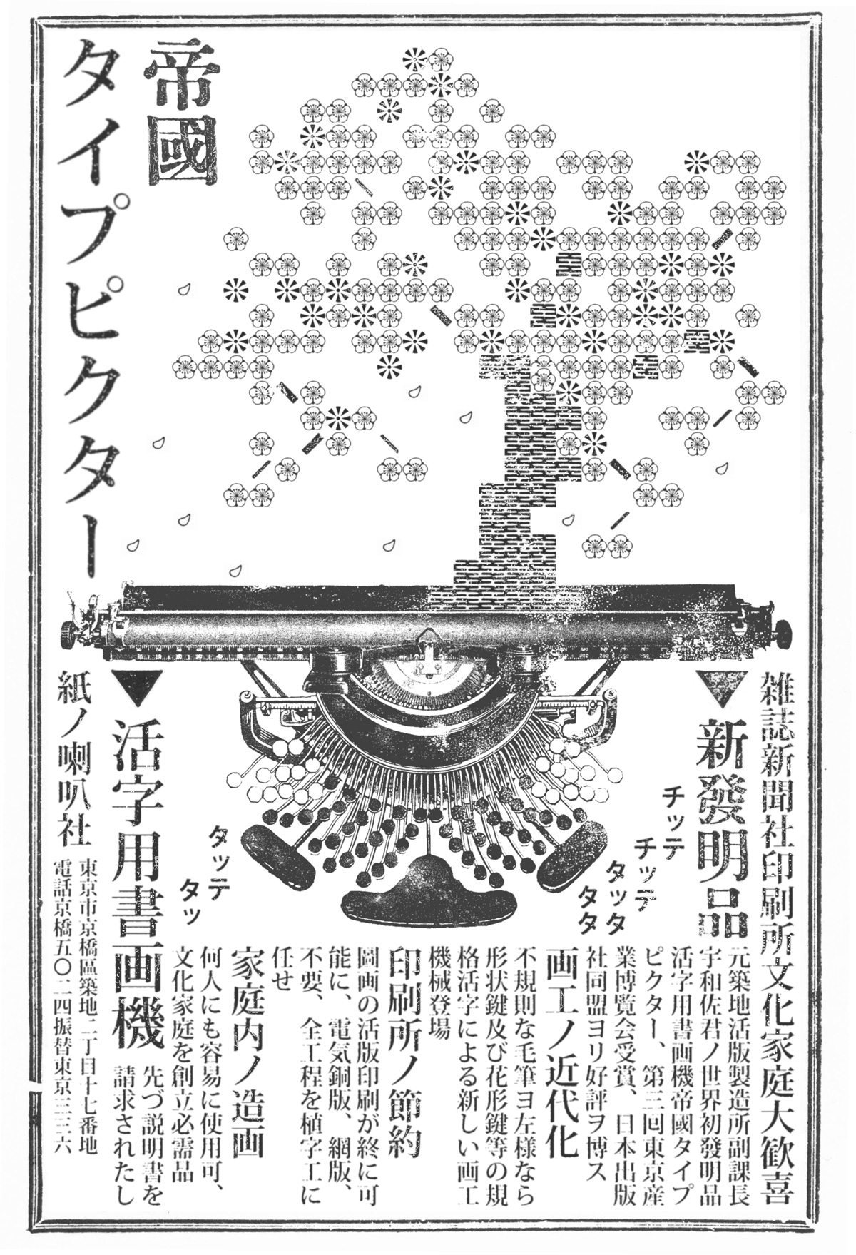
A typedrawing is segmental. It is made of discrete graphic units. Usually, individual units stand side by side, spaced. This, the default tracking of the Typepicter, is not in all cases observed. Occasionally, units are contiguous. At times, even overlapping. Amongst them are dots, dashes, hooks, carets, circles, spirals, triangles, squares, rectangles, and diagonals, as well as units of repeating pattern. This was the Typepicter’s type set. It aimed to provide the basic building blocks for rendering form, mass, and surface texture in the creation of images. An upper and lower case is evident. Some forms come in varying orientation. Some in both fill and outline. I count one-hundred-and-eighteen different individual typographic units. As with the typewriter, each would have been cast upon the head of a hammer, with majuscule and miniscule paired on one, making fifty or sixty-odd type sorts organized in the machine’s housing. Said array necessitated many more keys than the alphabet had letters. So, a doubled keyboard was devised. It can be seen, fulsome, spiny, in the ad.
Most units of the Typepicter’s type set are geometric, derived from the morphological economy of mechanical reproduction. On the other hand, some are calligraphic, indicating devotion to formal conventions of the ink-loaded brush. Unsurprising, then, that dominant amongst available typedrawing samples are landscapes of East Asian literati inspiration. All of those known appear in the pages of a pamphlet, designed as a graphic and aesthetic tutorial for the novice typedraftsman. Here too, continental forces are manifest, for the model book is modeled in no small part on that continuing standard for aspiring amateurs of the brush, the late seventeenth century Mustard Seed Garden Manual. How so? First, with its dragon peaks, withstanding pines, and inland shimmering seas. Second, with its telling you who draw, not just how to draw, but also who it was that made that how a should. It names forefathers. It upholds precedent. Even while, in its text, its examples, and the plain fact of its existence, it insists on embracing modernity. And third, with its atomism: its reduction of form to discrete and indivisible graphic elements. The Mustard Manual rested upon a related principle, particularly in its lessons on rocks, flowers, and foliage. Form is cataloged in typologies of shape and stroke. Picturing, in turn, is taught as the combination and variation of these types. The Typepicter makes of these practical suggestions material preconditions. Types are set, as in fixed, in a type set, finite, making possible the most perfect reiterations.
Most Typepicter units are not, in themselves, free morphemes. Meaning comes only in combination with others. In this, typedrawing is like freehand drawing. It is progressive, moving from atom to molecule, from graphic mark to grapheme. In such a scheme, the instantaneous creation of a semantically meaningful unit is not possible. Printing changes things. With it, marking and meaning can be made cotemporal. For sorts and plates et cetera store not just parts but wholes. With them, free morphemes can be printed with a single pressing, a single stamping, or a single stroke, as is the case with some of the keys of the Typepicter. As been said, most are not. But a handful of its type units are morphemically complete. A drawing apparatus with landscape and still life in its genes, flower blossoms number amongst such keys. Others offered greater polysemy: patterns, based largely on classicizing textile prints, but easily reappointed for use in rendering other sorts of textured things, including, but not limited to, stucco, wicker, wire mesh, sand, raked gravel, drizzling rain, pounding rain, falling snow, rippling water, falling water, rushing water, wood grain, tree bark, slicked hair, tousled hair, the body fur of forest animals and Europeans, pubes, fuzz, and stubble. And so on and on, especially for the advanced user of the machine once he or she had mastered the arts of typographic stacking and overlapping.
On the inventor of this contraption, there circulates a bit of lore that is worth relating, even though it is obviously embellished in certain of its details, making it more the stuff of the raconteur than the historian. His name was Uwasa Masato. Despite regular penury, he was an extravagant man. He dressed himself in European cotton fineries, pressed sharp and punctuated with a lacy pink cravat. The breast pocket of his suit jacket nested an English timepiece, which he never wound, but would often remove and inspect – through a monocled squint – in a public performance of civilization. He wore a mustache in the Bismarckian style and took to eating beef when his coffers allowed. But beneath this outer display of Westernization, he wrapped his loins with a fundoshi made of the finest Japanese silk, whitest striped in richest cinnabar. He was a man of superlatives in every direction.
Uwasa had collected a large number of typewriting machines. Though committing most to research, he cannibalized a few for a peculiar sartorial indulgence. He fancied his fingers with a set of self-fashioned rings, the keys of a Western typewriter extracted from the machine and bent around the phalanges of the second through fifth digits of his right hand, such that each knuckle was crowned with alphabetic type. Miniaturized embodiments of the Western world’s industrial deflation of the word, he wore them as a sort of souvenir of conquest over alien encroachment into native aesthetic common sense – Japan still wont to give up manuscript. An ironic statement, of course, for few advocated type as he had. His jewelry served also a martial purpose: a mean drunk prone to early morning fisticuffs, Uwasa could stamp the face of his foe with a puzzle. Upon sobering, the beaten would find typed upon his brow a syntagm of scabs that spelled in Roman alphabet a telltale infinitive: kaku, Japanese for both to write and to draw. The lower and upper case of a letter being cast on each key, the mark would read double – KAKU and kaku – leaving the punched to ponder a rich combination of semiotic relations through the haze of lingering shochu.
Translations
1. THE IMPERIAL TYPEPICTER
Rejoice! Magazine and newspaper publishers, print shops, and cultured households. A NEW INVENTION. Invented by former vice-manager at the Tsukiji Type Foundry, Mister Uwasa. The world’s first typographic drawing machine, The Imperial Typepicter. Third Tokyo Industrial Exposition Prize Recipient. High Praise from the Japan Publishers League. Modernizing picture craft. Farewell to the irregularities of the brush. Introducing a picture machine using form keys, pattern keys, and other standardized type. Economizing the print shop. The letterpress printing of images is at last possible. Electrotype and half-tone screen processing are no longer necessary. The entire printing process is put in the hands of the compositor. Make pictures at home. Easy operation for anyone. A welcome addition to the cultured household. TYPOGRAPHIC DRAWING MACHINE.
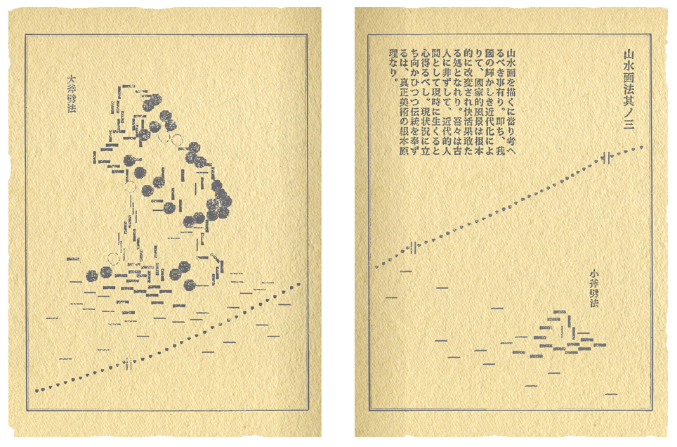
2. Drawing Landscape, No. 3
For drawing landscape, it is important to keep the following in mind. The national landscape is being radically modified and enlivened by our country’s glorious modernization. We are not ancients. We live in the present time as modern men. To face present conditions while honoring tradition is a basic principle of true art.
For drawing landscape, it is important to keep the following in mind. The national landscape is being radically modified and enlivened by our country’s glorious modernization. We are not ancients. We live in the present time as modern men. To face present conditions while honoring tradition is a basic principle of true art.
Right page: Small ax-cut strokes
Left page: Large ax-cut strokes